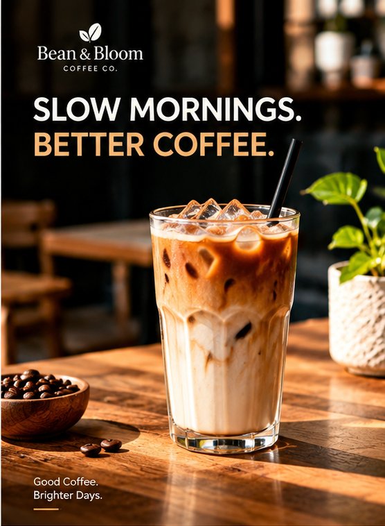
Bean & Bloom Coffee Co.: Promotional Poster Design
GRACE
Published
The Brief
A coffee shop needed an eye-catching poster to promote its iced coffee range and bring in morning customers. The design had to feel warm, relaxed and premium, with a short message people could read in a few seconds, and it had to fit the brand’s cozy café personality in both print and social media formats.
What I Made
I designed a vertical poster built around one hero image, a tall iced latte in warm sunlight on a wooden table. I wrote and set the headline, “Slow mornings. Better coffee.”, in a bold sans-serif, with the second line in a warm caramel tone that echoes the drink. I placed the Bean & Bloom logo at the top and added a short sign-off at the bottom, “Good coffee. Brighter days.”, with a small accent line. I kept the layout clean, with generous space around the text, so the product stays the focus.
The Result
The poster is inviting, easy to read from a distance and consistent with a modern café brand. It is ready for [print / Instagram / in-store display], and the layout can be adapted into story, flyer and menu formats.