Elegant Logo Design | Auraé Skincare
Debbie Ayomi
Published
Auraé Skincare came to us with a simple vision: a clean beauty brand that feels calm, organic, and effortlessly premium. Their tagline, “Glow Beyond the Surface,” set the tone for everything we designed.
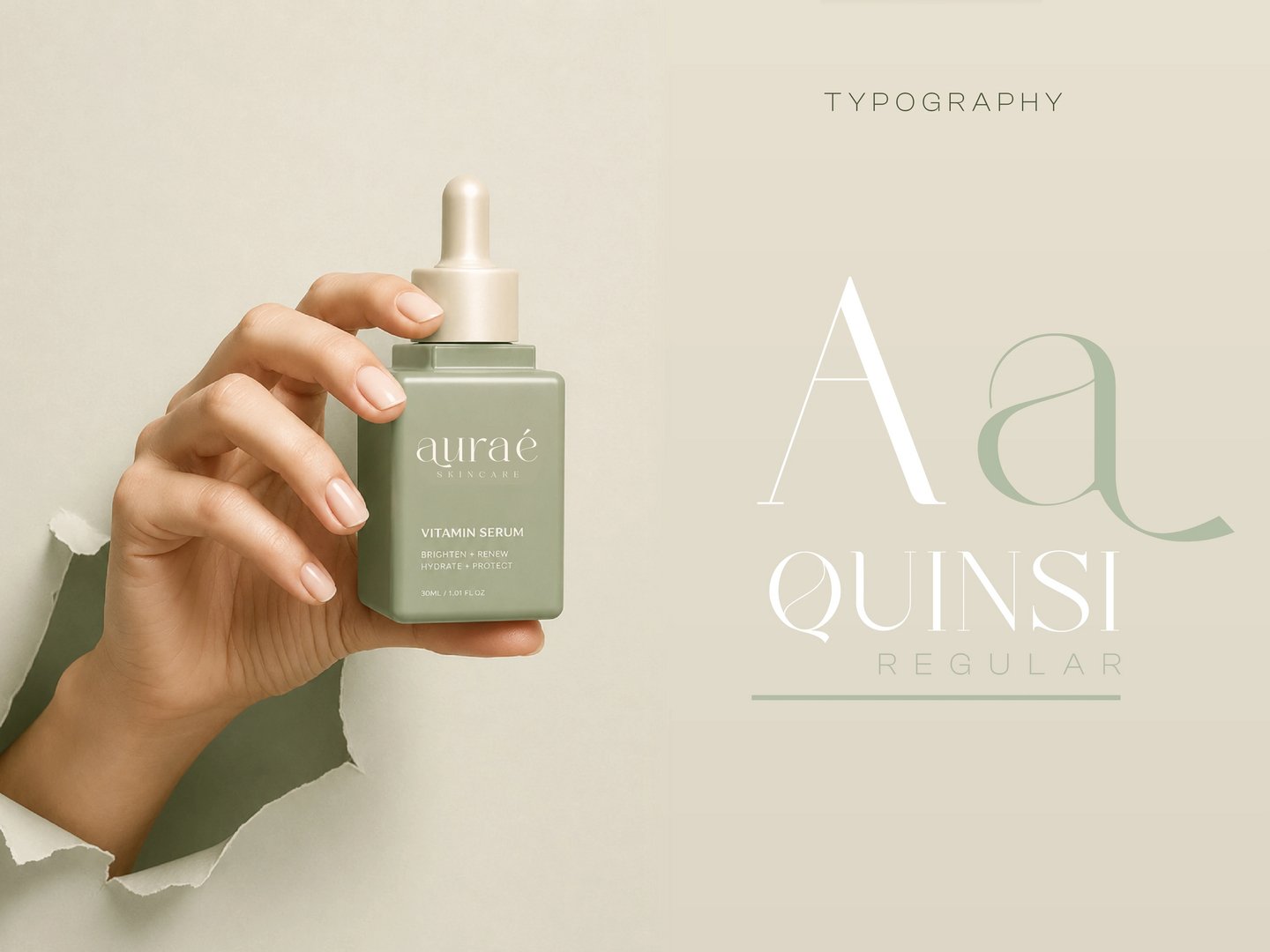
At the heart of the identity is a custom serif wordmark with delicate, flowing ligatures, the sweeping tail of the “a” and the graceful accent on the “é” give the name an organic softness that feels hand-crafted rather than typeset. Every curve was refined on a construction grid with defined clear-space rules, so the elegance holds up in professional use.
The palette pairs a muted sage green with warm cream (fully documented with HEX values), calm, botanical tones that instantly say clean beauty. We extended the identity onto product packaging, including the Radiance Renewal Cream jar with delicate botanical line illustrations and the Glow Serum bottle, plus campaign visuals and a “coming soon” product teaser to show the brand living in the real world.Auraé Skincare came to us with a simple vision: a clean beauty brand that feels calm, organic, and effortlessly premium. Their tagline, “Glow Beyond the Surface,” set the tone for everything we designed.
At the heart of the identity is a custom serif wordmark with delicate, flowing ligatures, the sweeping tail of the “a” and the graceful accent on the “é” give the name an organic softness that feels hand-crafted rather than typeset. Every curve was refined on a construction grid with defined clear-space rules, so the elegance holds up in professional use.
The palette pairs a muted sage green with warm cream (fully documented with HEX values), calm, botanical tones that instantly say clean beauty. We extended the identity onto product packaging, including the Radiance Renewal Cream jar with delicate botanical line illustrations and the Glow Serum bottle, plus campaign visuals and a “coming soon” product teaser to show the brand living in the real world. #graphicdesigner #logo #branding #designer #webdesigner