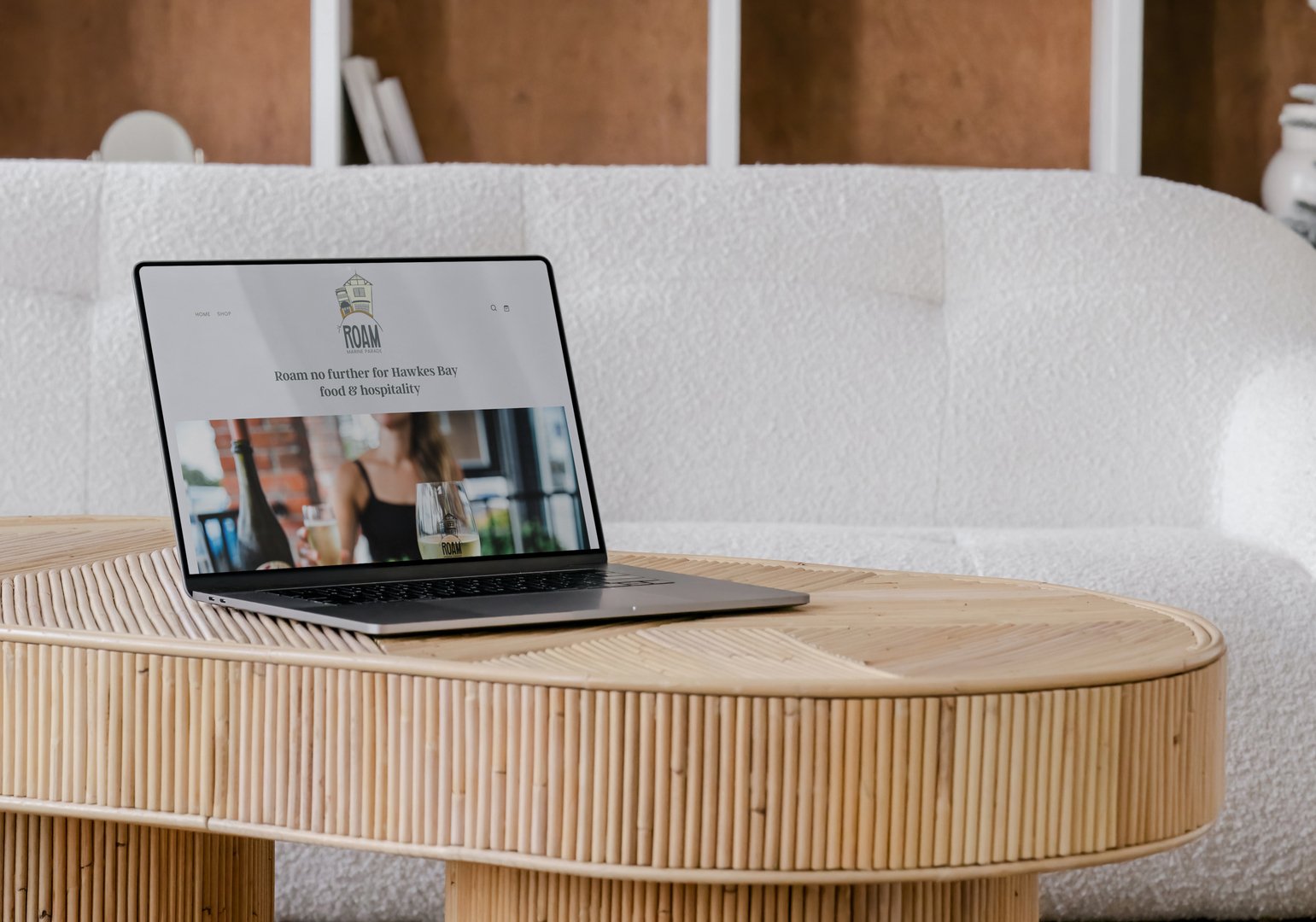
Brand & Website for Napier's new cafe Roam Marine Parade
Kelly Boxell
Published
The Client
Some clients you just know are going to keep doing exciting things — and Brad from ROAM is absolutely one of them.
I first met Brad a couple of years ago when he launched ROAM, offering grazing box and private chef experiences. His original brief was epically fun — hand-drawn fonts, a fish, a piece of cheese, a carrot. The kind of brief that makes a designer very happy indeed.
Then late last year, Brad called with news that surprised absolutely no one who’s ever tasted his food: he was expanding. A café was opening. And it was going to be gorgeous.
The Challenge
This wasn’t a start-from-scratch rebrand — it was something more nuanced than that. ROAM had an existing identity with real personality and brand equity worth keeping. The challenge was evolving it to carry a growing business without losing the charm that made it feel like ROAM in the first place.
The new brand needed to:
Honour the original identity while expanding it to fit a café, an online shop, and a growing suite of services
Reflect the heritage of the location — one of Napier’s iconic six sister buildings along Marine Parade
Retain the warmth, fun, and foodie personality that had already built Brad a loyal following
Work hard across a full range of touchpoints — digital, print, in-café, and everything in between
The Approach
We started with what already worked — and built thoughtfully from there.
Together we worked through:
Who ROAM’s clients are — food lovers who appreciate quality, creativity, and an experience that feels special whether they’re ordering a grazing box, booking a private chef, or pulling up a chair in the café
What makes ROAM different — Brad’s genuine passion, his incredible food, and the sense of joy and occasion he brings to every single offering
What the evolved brand needed to communicate — the same fun, characterful energy of the original, now grown up enough to hold a café, a heritage building, and an expanding business
Then we got to work on the visual identity:
A refined version of the original logo — retaining the beloved hand-drawn font while evolving the mark to reflect the full ROAM experience
The iconic Marine Parade building as the hero image — a nod to the heritage of the location and a proud statement of where ROAM had arrived
A fresh colour palette that felt new while staying true to the ROAM personality
New brand elements — including a cheeky little gherkin illustration, because of course 😉
An expanded collection of foodie illustrations used across the website, paper tissue, packaging, and more
The Results
ROAM now has a brand that reflects every delicious thing Brad has built.
The personality is still there. The fun is still there. The cheese, the fish, the carrot — and now a gherkin. But it’s all grown up, cohesive, and ready for whatever Brad does next.
See the full brand reveal here: https://www.twine.net/signin