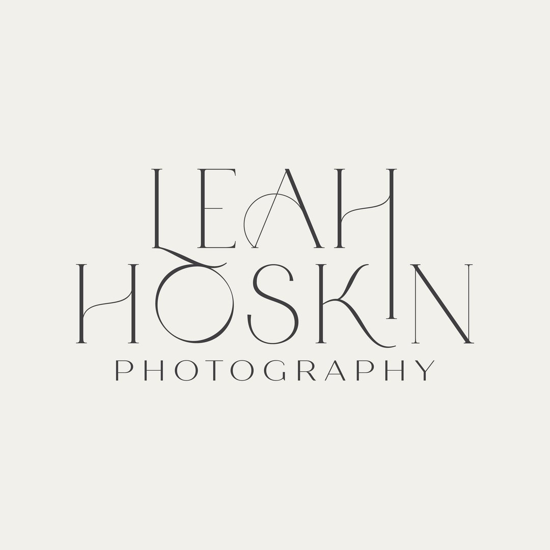
Full rebrand for Waikato birth & family photographer, Leah Hoskin
Kelly Boxell
Published
The Client
Leah specialises in maternity, birth, and family photography — and she has a rare, beautiful gift for capturing real emotion. The raw, unguarded, completely genuine moments that people want to hold onto forever. Her work is deeply personal. Her brand needed to be too.
The Challenge
Leah’s existing brand had done its job — but it had simply grown past it. She was evolving as a photographer and as a business owner, and she needed a visual identity that reflected where she was now, not where she’d started.
She needed a brand that:
Felt as warm, natural, and emotionally resonant as the photographs she takes
Reflected her personal aesthetic — earthy, modern, and quietly beautiful
Gave her a complete, versatile toolkit she could use consistently across digital and print
Felt unmistakably, personally Leah
The Approach
We started — as I love to do — with inspiration before decisions.
Leah built a Pinterest board, which immediately told me everything I needed to know: a love of warm brown and green palettes, modern fonts with a twist, and florals — particularly cherry blossoms. (And if you know Leah, you’ll know the cherry blossom tattoo on her arm. Of course that had to make it into the brand.)
From there we moved through a proper discovery process:
A discovery session to understand Leah’s business, her clients, and where she wanted to go
A mood board to set the tone and direction before a single logo was sketched — getting us both aligned on the look and feel before the design work began
Sketching and hand-drawn exploration — including original cherry blossom drawings that would become the heart of Leah’s new brand icon
A fully developed concept presented with all logo variations, icons, and mockups so Leah could see exactly how everything would come to life in the real world
Then we refined, proofed, and polished until every element was exactly right.
The final brand identity includes:
A primary logo — the hero mark that will feature across most of Leah’s touchpoints
A stacked logo variation — condensed and versatile, perfect for social media profiles and tighter spaces
A brand mark — a clean, simple initial logo that works beautifully as a watermark on Leah’s photos
Cherry blossom icons in varying colours — for adding warmth and personality across both digital and print spaces
A rich, earthy colour palette of browns and greens that feels completely cohesive with Leah’s photographic style
A full visual brand guide covering colours, fonts, and logo usage — so Leah always knows exactly how to show up consistently
The Solution & Result
The result is a brand identity that feels as considered and emotionally rich as Leah’s photography itself.
A complete, versatile logo system built for real-world use
A warm, earthy colour world that feels cohesive across every platform
A brand guide that makes consistency effortless going forward
See the full brand reveal here: https://www.twine.net/signin