Fire Core Safety Solutions
Krishna Harsora
Published
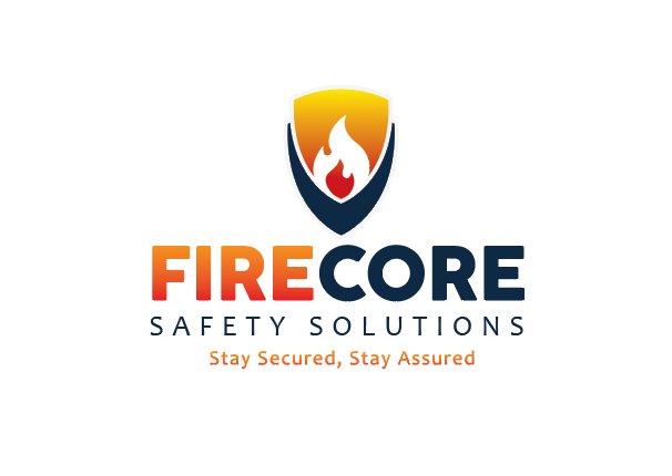
FIRECORE Safety Solutions is built as a brand that represents protection, trust, strength, and professional reliability. The identity is designed to create a strong and confident presence in the safety and security industry while maintaining a modern and impactful visual language.
The brand concept is inspired by the idea of double protection, represented through the shield-based identity system, reflecting safety, security, and dependable service. The flame element symbolizes alertness, emergency readiness, and the core focus of fire and safety solutions.
The combination of orange and navy blue creates a balance between energy and professionalism — where the warm tones represent action, awareness, and fire safety, while the dark blue builds a sense of trust, stability, and confidence.
The overall branding is designed to be scalable and versatile, allowing the identity to work effectively across uniforms, safety equipment, vehicles, signage, social media, and professional branding materials while maintaining strong recognition and clarity.
Overall, FIRECORE is developed as more than just a logo — it is a complete brand identity that communicates safety, strength, reliability, and modern professional standards.
#graphicdesigner #designer