From start-up to category best-seller: Transforming a brand through packaging design
Neil Harrison
Published
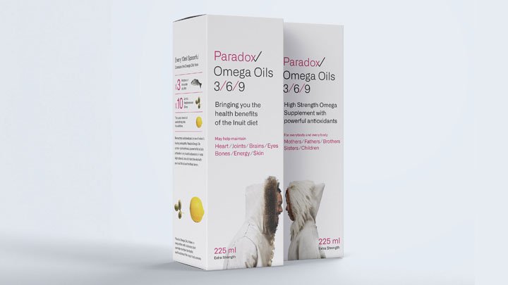
As a new entrant to the health supplement market in Northern Ireland, Paradox needed an identity that stood for something different, alongside packaging that could draw the eye in a saturated marketplace. The benefits of an Inuit-style diet was discovered in research and was something unique to the supplement sector.
A ‘paradox’ was created within the logo with a tick that was simultaneously a cross; whilst the packaging could be rotated to create an Inuit-style kiss between two characters to grab, attention on the shelf.
“Once we saw the brand concepts we were hooked. Paradox Omega Oil has now established itself as a category best seller and is one of our distributors top 5 products by revenue.”
Ian Pennick, Marketing Director, Paradox Oils