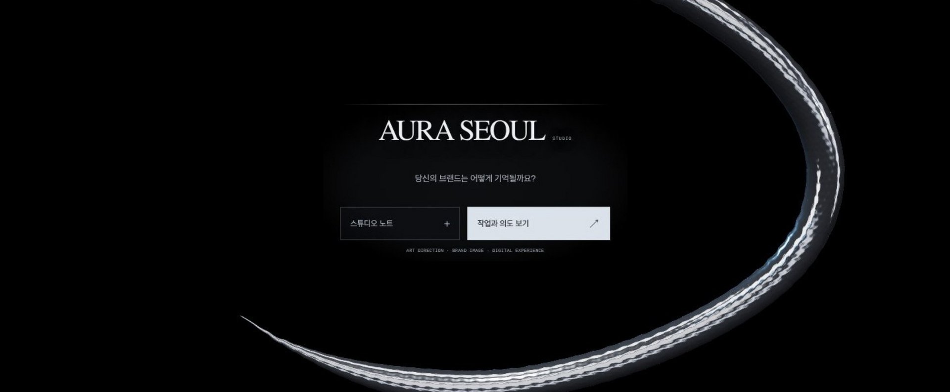
AURA SEOUL: Brand Identity & 3D Website
SANHEE LEE
Published
0
The brief: An identity for my own studio, AURA SEOUL, that feels cinematic, precise and quiet.
What I made
- Wordmark, star symbol and a chrome visual language
- A website where, on scroll, the logo turns into the symbol and a chrome serpent, with one line of copy per scene
- A motion on/off toggle for accessibility
- Two brand characters, SAN and HEE, each with their own visual rules for images and short clips
Result: One consistent visual world across the website, motion and social.