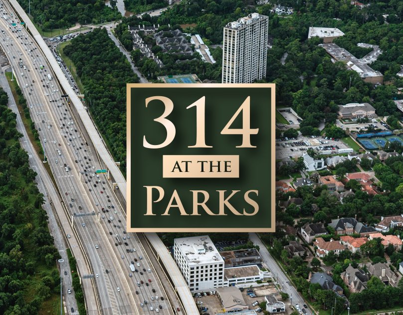
314 At The Parks
Jacob Holden
Published
A client approached me looking to have brochure made to promote their property. They didn’t have a concept in mind beyond wanting to express luxury. They did however provide a few photographs, a conceptual building rendering, a fact sheet, and a name, 314 at the Park. From there I was trusted to build a brand and look.
I started by creating a solid branding. The aerial photography provided, was bathed in the natural greens of the tree top of Houston’s Memorial Park (one of the largest urban parks in the United States, nearly double New York’s Central Park.) Since I knew the color green would be very present in this project I would have to design around that. Green is not just associated with nature but also wealth, and I would highlight that by accenting everything with a golden gradient. With a color scheme decided I moved on the typography. I feel like serifs have an opulent aire to them, so I wanted to take advantage of that. I chose Goudy because it has a particularly iconic capitol “P” in which the stroke leaves a gap.
After the logo was approved, work on the brochure would begin at full force. The customer expressed how they wanted all of the near by businesses, and other points of interest in it’s proximity, to be listed out. I would add on to that concept by creating pins to point those businesses on the provided photos. I would go on to curate more iconography for the brochure including a map depicting the location square footage, and dimensions of the property.
As the brochure was wrapping up, it was decided by the client, that the concepts and branding would re-purposed for all manner of publications. A version of the brochure modified for the web, as well as presentation slides, and a video would be created based on the designs I developed.