Transforming Healthcare Management with an Intuitive Dashboard
Amuda Ashimiu
Published
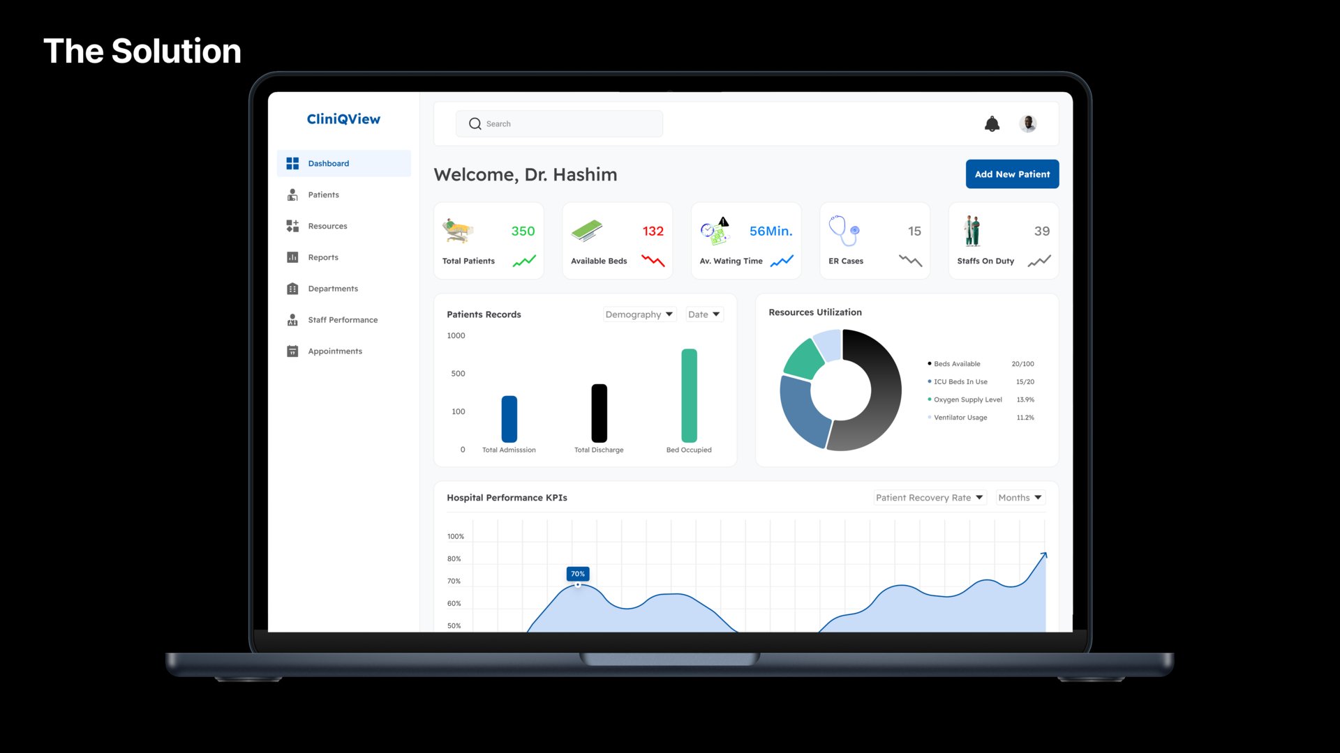
I designed a Healthcare Management Dashboard to simplify the way medical professionals track patient data, appointments, and analytics. The goal was to create an efficient, user-friendly interface that helps healthcare providers focus on what truly matters—patient care.
What I Did:
✔ User Research & Workflow Analysis – Studied how doctors, nurses, and administrators interact with medical data.
✔ Dashboard UI/UX Design – Created a clean, organized layout with easy navigation for patient records, schedules, and reports.
✔ Data Visualization – Designed intuitive charts and metrics for tracking patient trends and hospital performance.
✔ Accessibility & Compliance – Ensured the design meets healthcare usability standards for clarity and efficiency.
Why It’s Special:
💡 Streamlined Patient Management – Reduces complexity and improves workflow efficiency for healthcare professionals.
📊 Actionable Insights – Provides real-time data visualization to help with better decision-making.
🎯 User-Centered Design – Built with the needs of medical staff in mind, ensuring ease of use and accessibility.
This project showcases my ability to design for complex industries like healthcare while ensuring the interface is functional, data-driven, and visually engaging.
You can check the full case study here:
#HealthcareTech
#HealthDashboard
#MedTech
#UXForHealthcare
#UIUXDesign
#DataVisualization
#HealthcareUX
#DigitalHealth
#HumanCenteredDesign