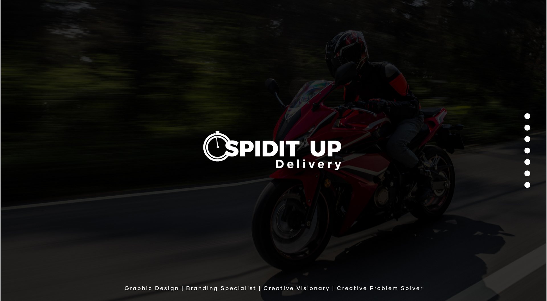
SPIDIT UP DELIVERY
Andrew Enesi Sani
Published
0
The logo is a combination of a wordmark and a symbol, making it a combination mark. The wordmark, “SPIDIT UP DELIVERY,” is set in bold, sans-serif typography, suggesting speed and efficiency. The symbol is a stylized stopwatch, directly representing the concept of delivery speed. The colour scheme is predominantly red, conveying a sense of urgency and energy. Overall, the logo effectively communicates the brand’s identity and messaging. #logo #graphicdesigner #branding #illustrator #designer #photo