Bianchi Bella's Olives | Logo, Wordmark, Branding
Ben M
Published
The Bianchi Bella Company is a family-run business rooted in tradition, offering authentic Italian olives with integrity and consistency. Founded in the 1940s by Mr. Bianchi in Foggia, Puglia, the company began with door-to-door olive sales and grew into a successful vineyard and retail/wholesale operation. Known for their signature Bella di Cerignola olives, the Bianchi family continues to take pride in producing some of the plumpest, most flavorful olives in the world.
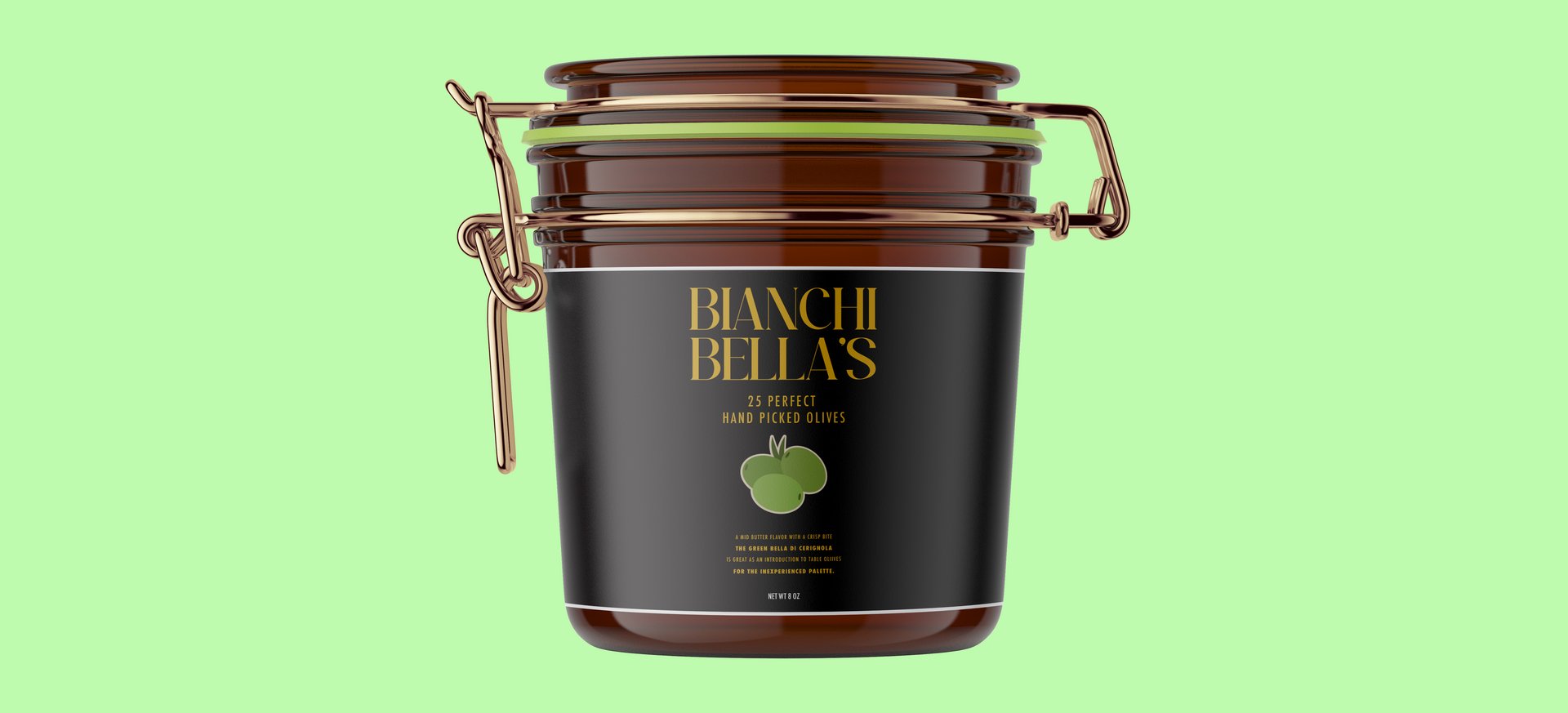
The concept for this wordmark was to make it luxurious and high end. This product would be sold at higher end supermarkets and therefore would need a design that would reflect the price tag.
With a serif typeface, and the gold lettering on the label, this design brings forward the classy expensive vibes that Bianchi Bella’s has.
The challenge for this project was stepping into a design style I wasn’t used to. As a big fan of geometric sans serifs, I didn’t have a library of beautiful serif typefaces in my mind, so exploring online for one I felt fit the brand was an additional challenge. I used this project to flex my adaptability and the flexibility in my design skills.