Picture Pop Popcorn | Logo, Package design, Wordmark
Ben M
Published
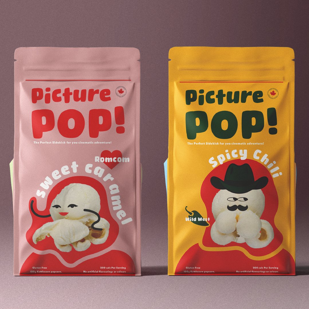
Picture Pop was a artisanal popcorn concept. The project was done over the course of 7 hours as an in class assignment.
Wanting to create a fun, eye catching, and bold design, I opted to create characters to place onto the front of the packaging. Pairing this with bold colours and a rounded non-uniform typeface created an exciting brand design concept. The project started with brainstorming my wordmark. I found the typeface called “Winter lemon” and it seemed perfect.
With some tweaking of each letter to make them imperfect, the wordmark became something that really draws in the eye!
As for the character design, I thought the contrast between the bold lines and colours of the packaging and wordmark with a high detail photo of popcorn would be an interesting idea.
The characters design match the flavour names perfectly, with a popcorn shaped like a dress or skirt for the “Romcom” flavour, and a popcorn wearing a cowboy hat for the “Wild West” flavour.