Logo Qadash
Fabiana Ferraresi
Published
The primary goal of the school is to offer pedagogical assistance to children aged 5 to 12 during after-school hours, helping them with school assignments and fostering their educational development.
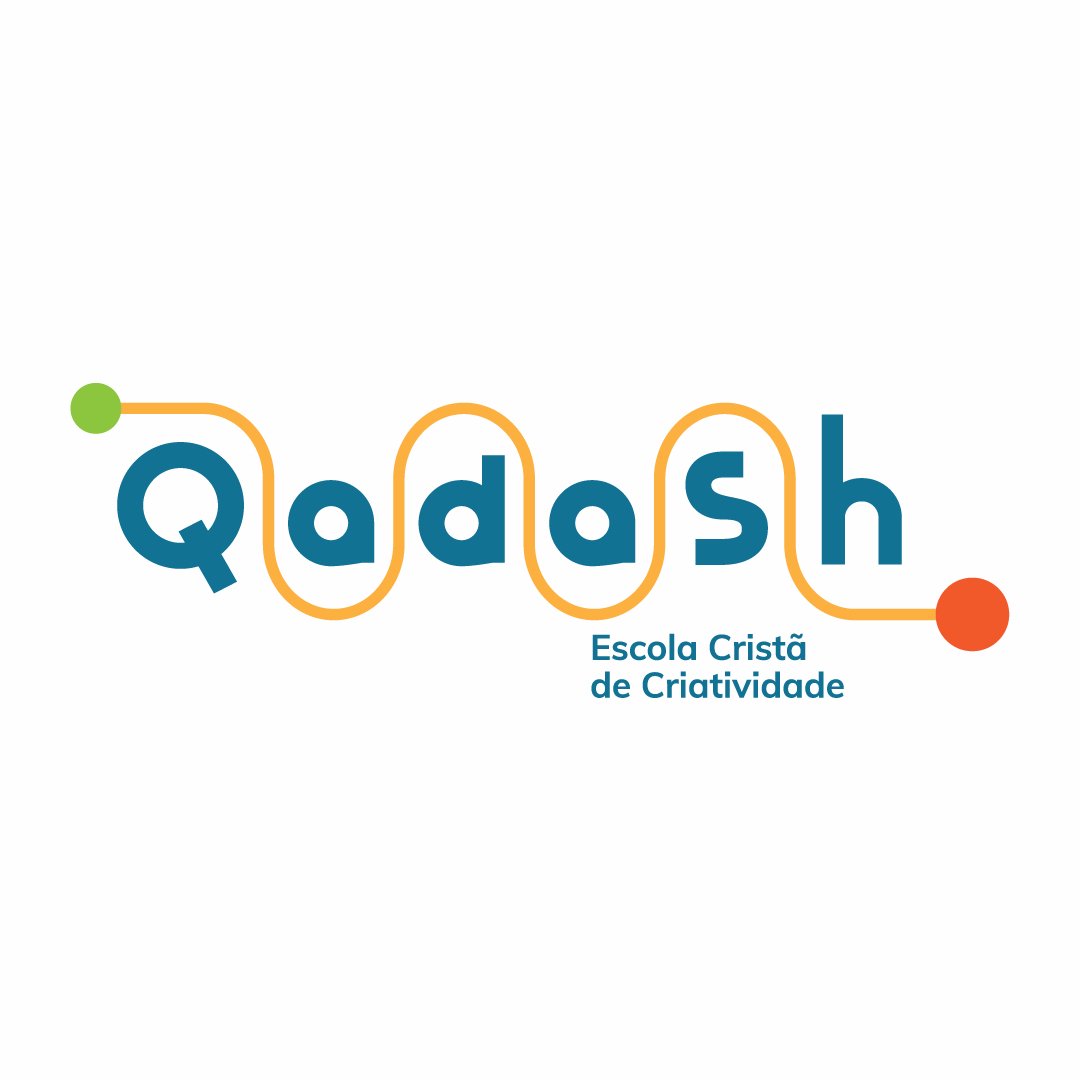
As the concept for the identity, a continuous line runs through the letters Q, A, D, A, S, and H, representing the path taken by the children at Qadash. This line symbolizes the educational and transformative journey. It visually conveys the progression each student experiences during their time at the school, carrying with them a growing informational, creative, and cognitive foundation.
At the beginning of the line, there is a smaller, green circle. This circle represents the child entering Qadash, carrying their initial potential and knowledge. It is the starting point of the educational circuit.
At the end of the line, there is a larger circle in a different color (orange). This circle symbolizes the child after completing their journey at Qadash—now more complete, capable, and transformed. The difference in size and color between the two circles illustrates the growth and evolution the child undergoes throughout their journey at the school.
Initial Circle (Green): Represents hope, freedom, youth, and the child’s initial potential.
Final Circle (Orange): Reflects joy, vitality, prosperity, the knowledge gained, and the fulfillment achieved at the end of the educational journey.
The growth and transformation reflected in the circles are a testament to the positive impact Qadash strives to provide to each student. #logo #graphicdesigner #branding #illustrator #designer