Branding Santalac
Fabiana Ferraresi
Published
Visual Identity for a Dairy Company from Minas Gerais
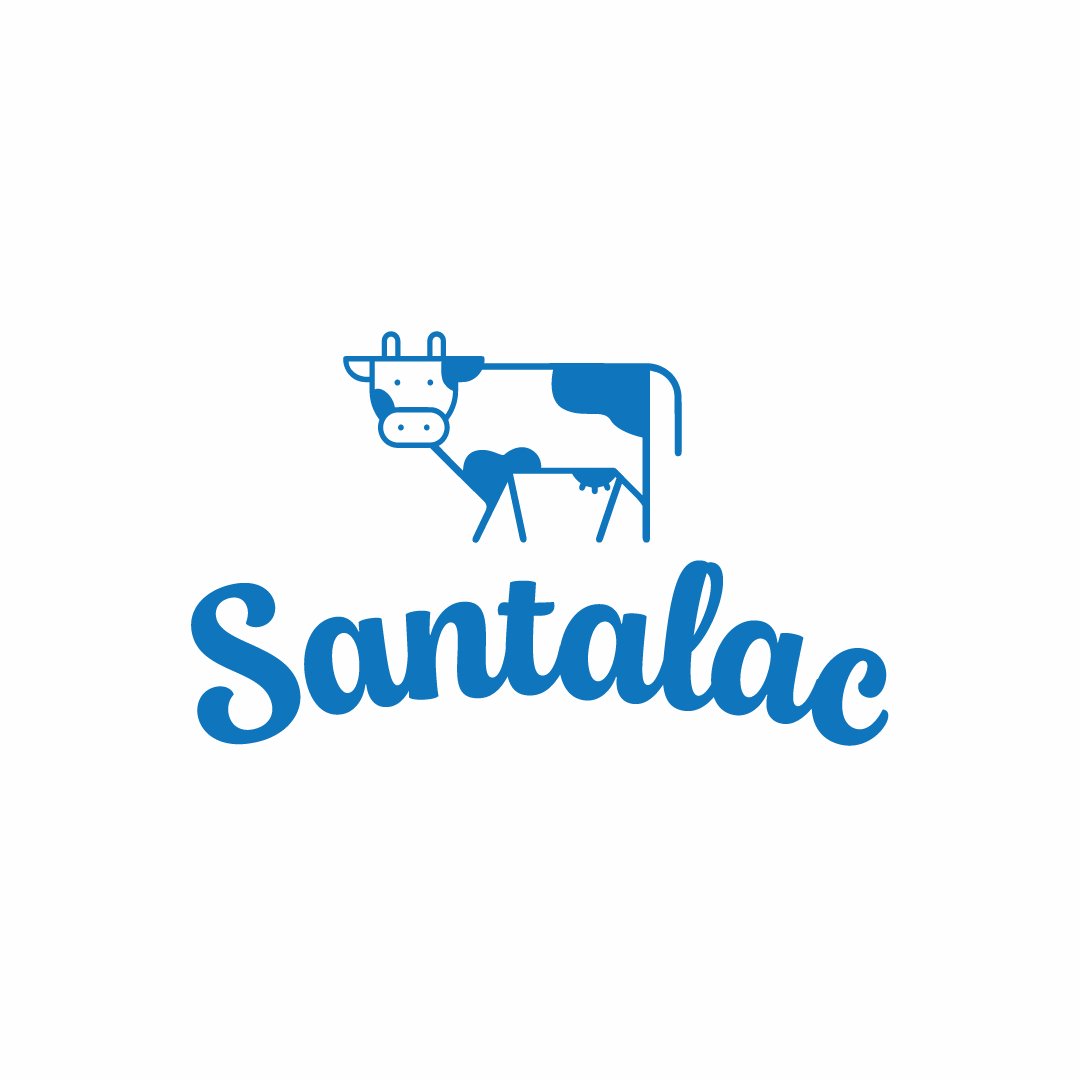
For the development of the SANTALAC brand, the cow symbol was strategically selected to establish an immediate and emotional connection with the target audience. The cow is a universally recognized icon associated with milk and its derivatives, representing an animal that has provided essential nourishment to people for centuries. Its presence evokes feelings of familiarity, tradition, and, above all, trust.
The friendly expression of the cow is a crucial element in building the visual identity. After all, first impressions are fundamental, especially when introducing a new product to the market. The cow, with its “kind and approachable” appearance, sends a clear message that the product is trustworthy, healthy, and worthy of consumer preference.
In a market where the brand is still unfamiliar, trust becomes a valuable asset. People tend to buy products they can rely on, and the friendly cow creates an emotional bridge that helps overcome the initial barrier of unfamiliarity. By associating the product with such a positive and recognizable figure, we are not only building a brand but also fostering an emotional bond that encourages consumer preference. #logo #graphicdesigner #illustrator #designer