Grindset
Fluence Global
Published
Grindset was created around a clear idea: progress begins in the mind.
The project focused on building a strong and energetic brand identity for a performance-driven concept connected to discipline, consistency, personal growth, and long-term evolution.
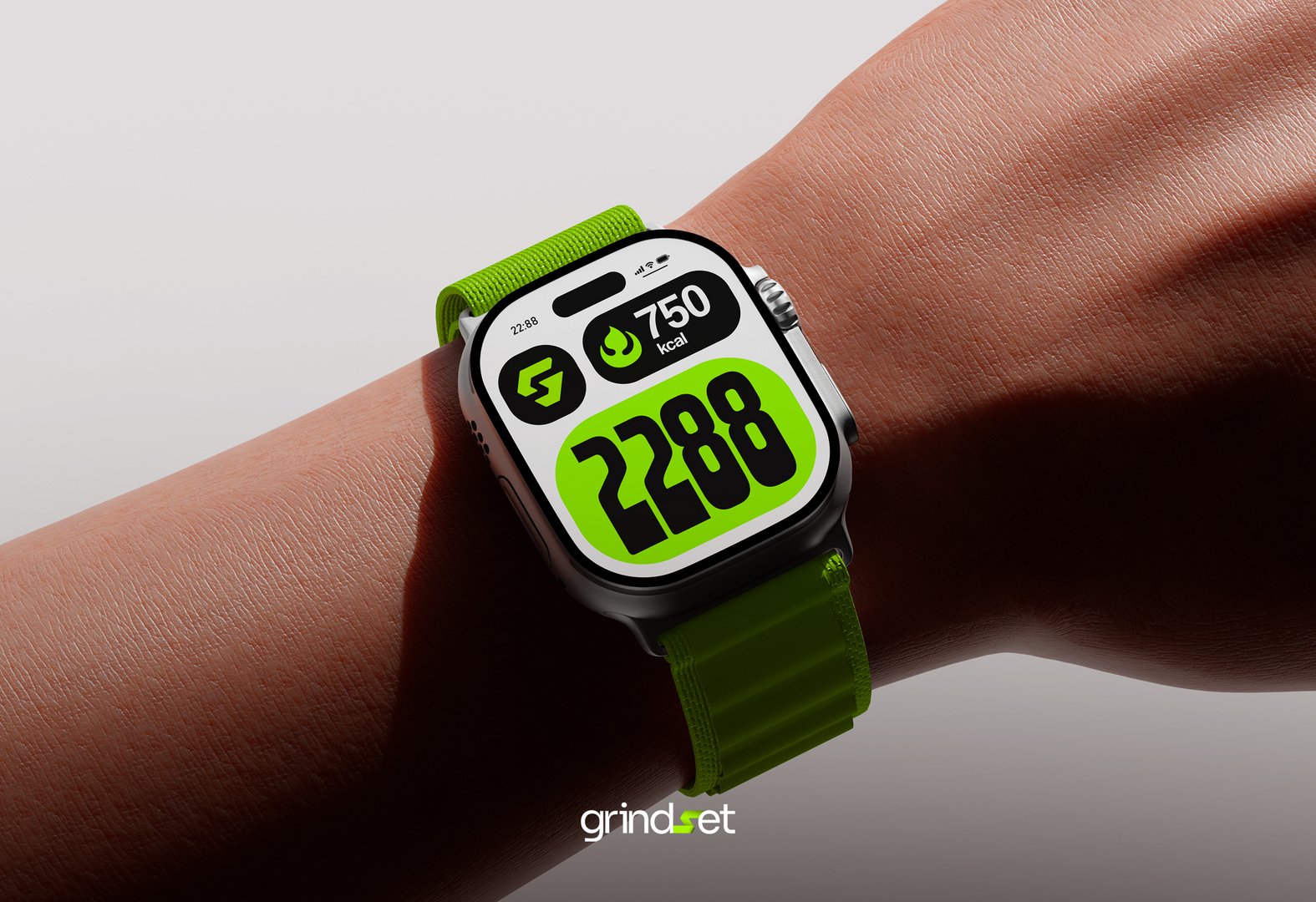
For the logo, Fluence developed a symbol that merges the letters “G” and “S” into a single visual form. This combination represents the relationship between discipline and consistency — two essential pillars behind progress and self-development.
The visual system uses a bold green palette to communicate growth, movement, energy, and transformation. The typography combines Bebas Neue and Sora, creating a balance between strength, modernity, and digital clarity.
The brand was structured with three logo versions: a simplified mark for versatile use, an isotype for quick recognition, and the full logo for moments where the brand needs stronger presence and readability.
The final identity is modern, bold, and scalable, designed to support Grindset across digital platforms, social media, app environments, and high-impact brand applications.
#branding #brandidentity #visualidentity #logodesign #branddesign #graphicdesign #sportbranding #fitnessbranding #performancebrand #digitaldesign #creativeagency #brandstrategy #logosystem #typography #mockup #adobellustrator #photoshop #socialmediadesign #visualcommunication #designsystem