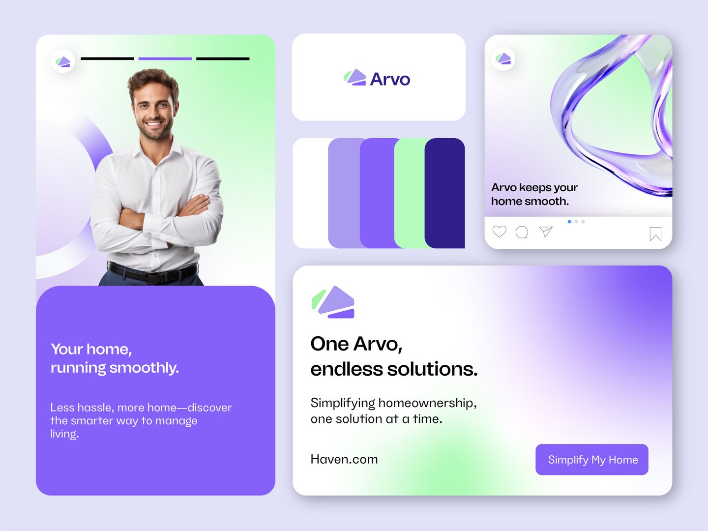
ARVO | Clean & Minimal Business Presentation Design
Izzah Waheed
Published
Thought Process
The identity for ARVO was designed to feel modern, calm, and trustworthy, reflecting the emotional importance of homeownership. Rather than using a literal house symbol, the logo adopts an abstract geometric form to represent structure, progress, and forward movement.
The layered, angled shapes suggest guidance and growth, symbolizing ARVO’s role in helping people move confidently from intention to ownership. The simplicity of the mark ensures the brand feels premium, adaptable, and future-focused.
Color Theory
The color palette is built around cool purples with subtle gradient tones, chosen to communicate trust, stability, and sophistication. Purple also introduces a sense of innovation, helping ARVO stand out while remaining reassuring.
Soft gradients add depth and motion, reinforcing the idea of a journey rather than a static service, while clean white space keeps the identity clear and approachable.
Typography
The typography is minimal and contemporary, balancing geometric precision with soft curves. This creates a tone that is professional yet human—supporting clarity, transparency, and ease of understanding, all essential to homeownership services.