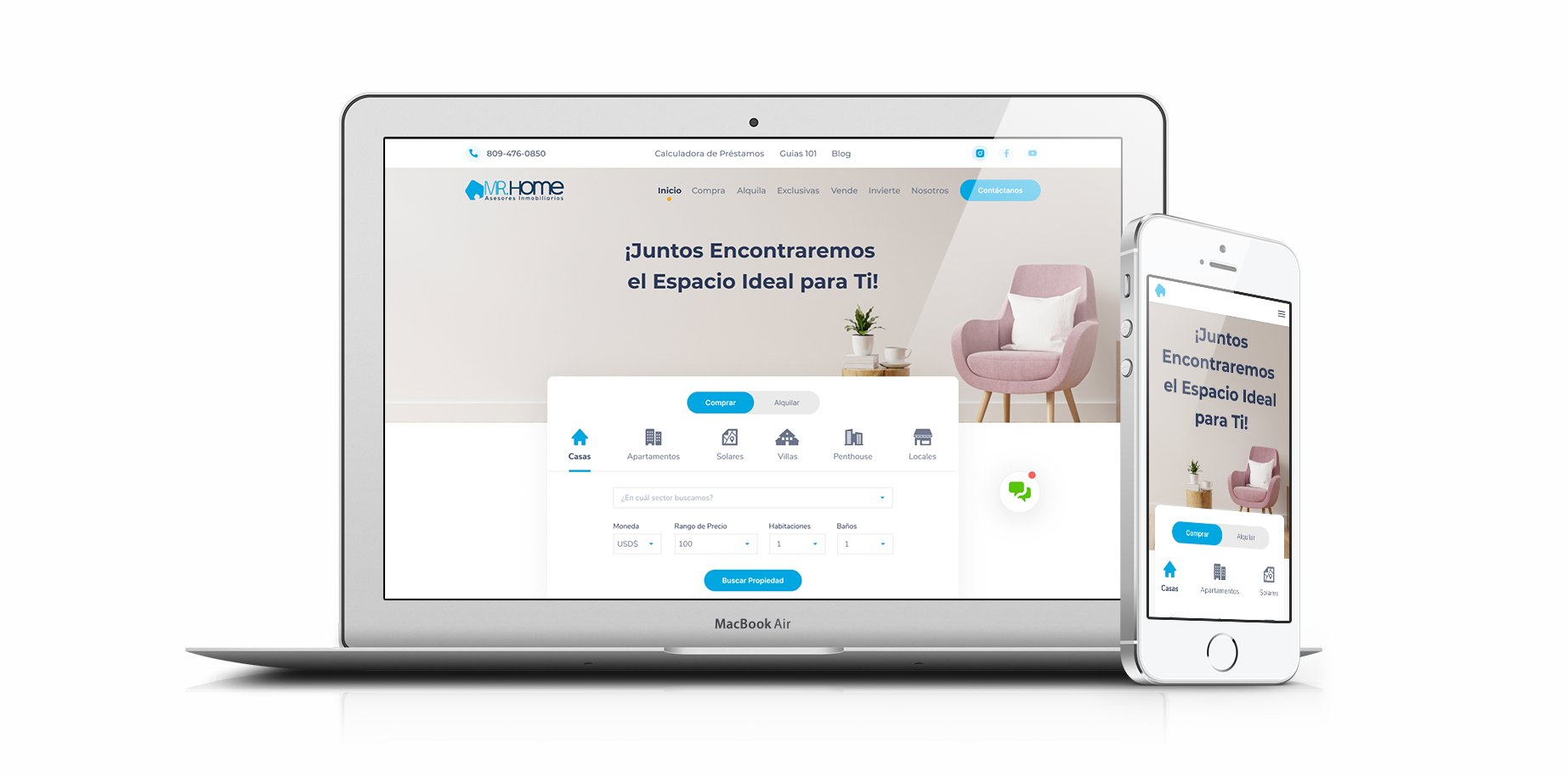
mr.home.com.do
Juan Tomás Valenzuela Pérez
Published
About
For my final project of the course Fundamental Principles of UX of https://www.twine.net/signin, I prepared a report for the website mr.home.com.do with analysis, principles of interaction design, information architecture, and a heuristic evaluation to improve the usability of the same. Once the report was finished, I applied the details to UI Design
Requirement:
- UX report
- Wireframing
- Prototyping
- Visual Design
Target
A user of the age 18 – 60 years.
ProjectGoal
Improve the usability of the mrhome.com.do website so that the user has agility when buying, renting, or selling a property.
ObjectivesAnalysis
Show properties to rent, buy or sell in an agile and simple way. The user must have the ability to search, classify properties, select the desired area, view precise and concise property information, contact real estate agents, be able to leave their data and view the web on their mobile device.
Observations
The Mr. Home website has around 13 sections, which can be overwhelming for a first-time user. I believe that for better experiences the content displayed in the Home and other sections can be simplified and better categorized.
More emphasis should be given to properties for sale, rent, search engines, and the loan calculator.
“Less is More”
-Mies Van der Rohe –
Principles of InteractionDesign
Conventions
The web must be adjusted to make it easier for the user, although certain information can be understood thanks to the use of icons and titles.
Perceptibility and predictability
The consistency of buttons, cards, and icons had to be improved since in some sections the styles look different. Navigation can be simplified and the design of the top bar, logo, and main menu should be improved to achieve a balanced distribution in the upper space.
Observation
Taking into consideration the time factor, nowadays people do not read extensive information. A Real State website is very loaded with a lot of information.
I believe that the design should be improved and its content simplified with a style similar to ww.airbnb.com precise and concise. The hero image should be enhanced so that the text has better contrast, with a dark blue overlay perhaps. Also improve the distribution of the CTA, search engine, and Image. #webdesigner