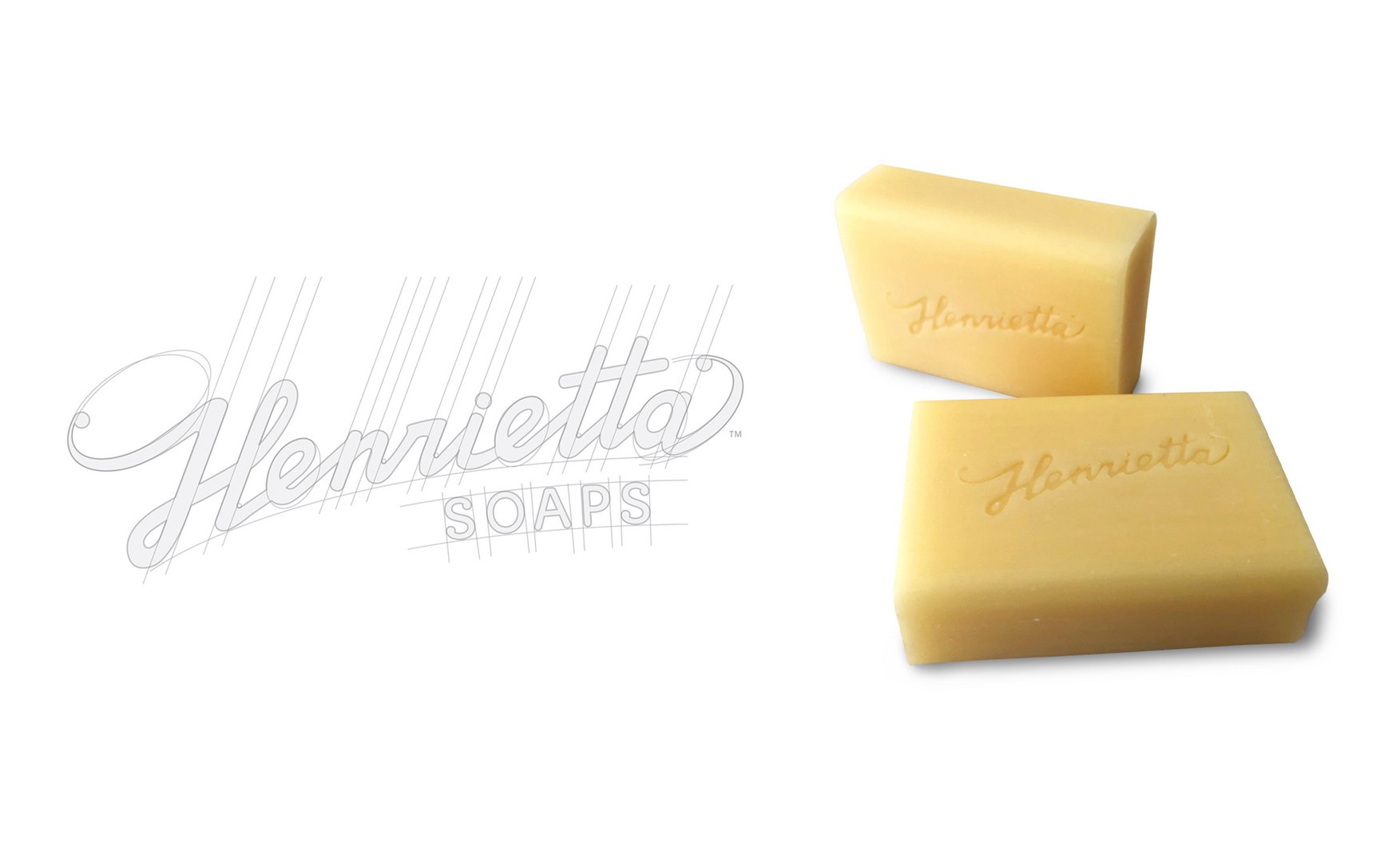
Henrietta Soaps Brand Refresh
Kelvin Cunningham
Published
This brand and logo / identity was slowly deteriorating with the printers reproduction process. Their cheap “we can do it”, she be right attitude, sometimes replaced the logo with a typical system font or traced it slowly destroyed the edges of it’s form to a point of no return. The old was gone but was still needed to reflect the historical handwritten element of the brand itself. To future proof while enhancing the origins of a home/handmade, handwritten logo type, this new logo was created. The natural curve of the name was held on to while letter weights and relative angles were created to build continuity within its form. The addition of the ‘H’ and ‘a’ swash were introduced to align the logo with the word soap written underneath. #logo #branding #graphicdesigner #brandrefresh