Branding for DCE Diecasting Engineering
Kishore Natarajan
Published
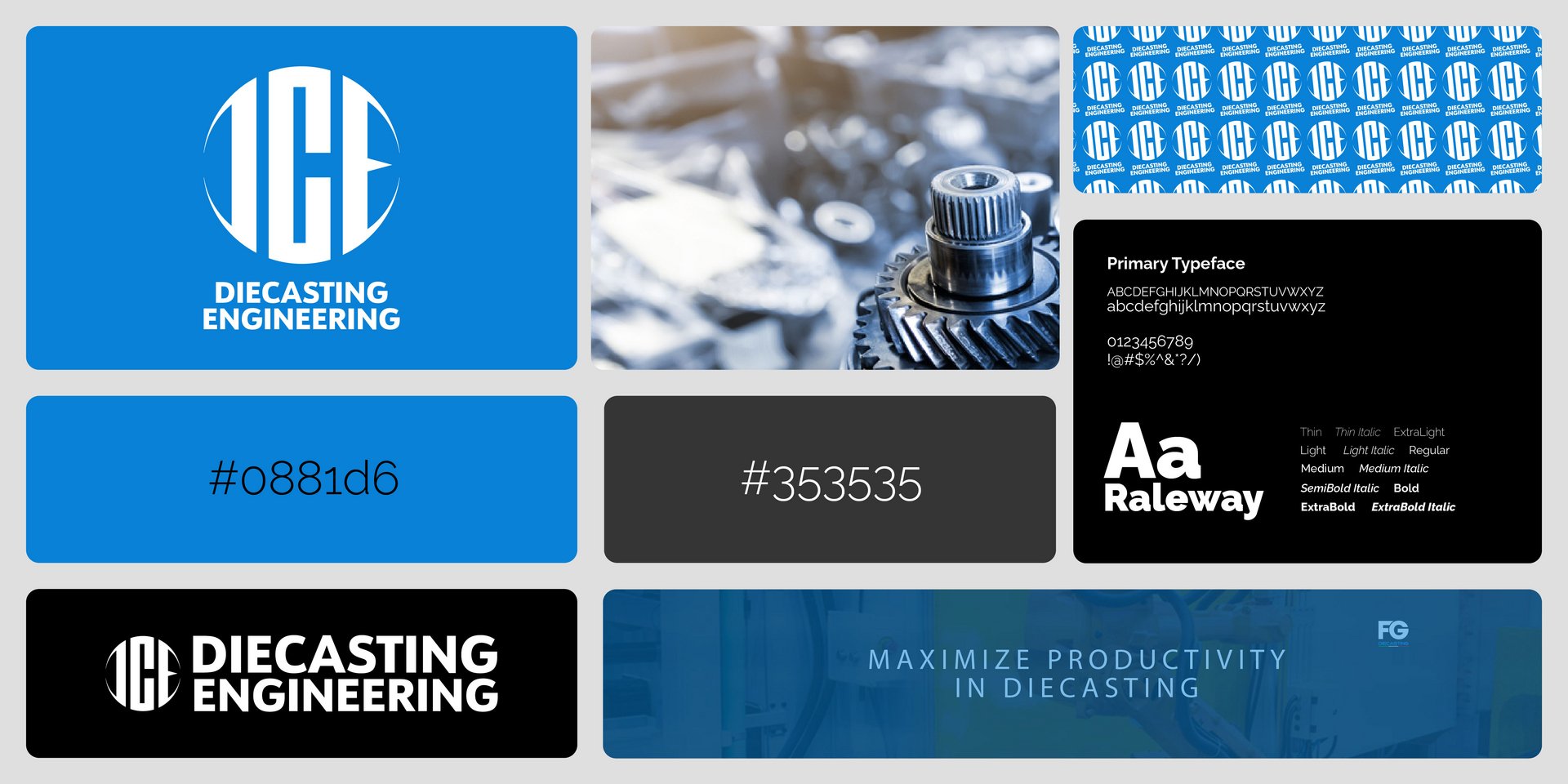
So for this project, I wanted to build a complete brand identity from scratch for a diecasting engineering company based in Italy. The goal was to find that exact sweet spot between heavy, industrial manufacturing and clean, modern digital aesthetics.
Here is how the system came together:
The Logo & Monogram: I designed a bold “DCE” monogram that uses these sharp, curved cuts right inside the letterforms to give it a dynamic, precise look, and paired it with a clean, tracked-out sans-serif for “DIECASTING ENGINEERING” underneath. I set up flexible lockups—like a vertical version centered on a vibrant blue background and a horizontal version styled for dark layouts—so it looks solid across everything from digital screens to physical signage.
Color Palette: I went with a striking primary blue (#0881d6) to bring in that modern, high-tech energy, backed by a heavy industrial charcoal (#353535) to keep it grounded and professional.
Typography: I chose Raleway as the main typeface because its weight range (from thin lines all the way up to heavy extra-bold) gives you so much room to play with hierarchy. It keeps technical text looking sharp and readable.
Patterns & Collateral: To tie the whole brand together, I built a repeating grid pattern out of the monogram for backgrounds or packaging, alongside clean business card layouts and promotional banner mockups featuring real industrial environments with the core tagline: “MAXIMIZE PRODUCTIVITY IN DIECASTING”.