Created Brand Identity for Mangrove Services
Kishore Natarajan
Published
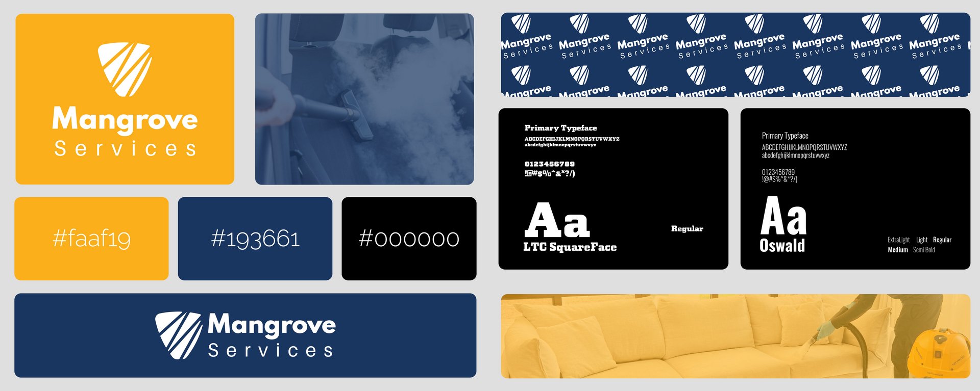
So for this brand, Mangrove Services, I wanted to create a visual identity from scratch that feels trustworthy, clean, and professional—ideal for a cleaning or home/vehicle care services business.
The Logo & Symbolism: I designed a custom shield-like emblem featuring diagonal clean stripes that symbolize protection, care, and thorough cleaning, paired with a modern, rounded wordmark for “Mangrove” and clean tracked-out lettering for “Services” underneath. I set up flexible color lockups—like a warm gold/yellow version and a deep navy version—so it easily adapts to different backgrounds.
Color Palette: I went with a vibrant, friendly gold/yellow (#faaf19) to represent energy, warmth, and cleanliness, backed by a deep, reliable professional navy (#193661) and pitch black (#000000) to ground the brand.
Typography: I incorporated clean, highly readable typefaces like Lato and Agape. Having access to a full range of weights from Hairline and Thin all the way to Bold, Heavy, and Black gave me total flexibility for clear hierarchy across headings, service descriptions, and branding.
Patterns & Collateral: To tie the whole brand identity together, I built a repeating monogram pattern for packaging or surfaces, alongside real-world application mockups showing professional steam cleaning in action on car interiors and plush yellow sofas.