Ganache Galaxy
Krishna Harsora
Published
Ganache Galaxy is designed as a modern and expressive brand identity that connects creativity, sweetness, and youthful energy into one visual experience. The overall branding focuses on creating a fun, memorable, and visually engaging personality that strongly appeals to the Gen Z audience.
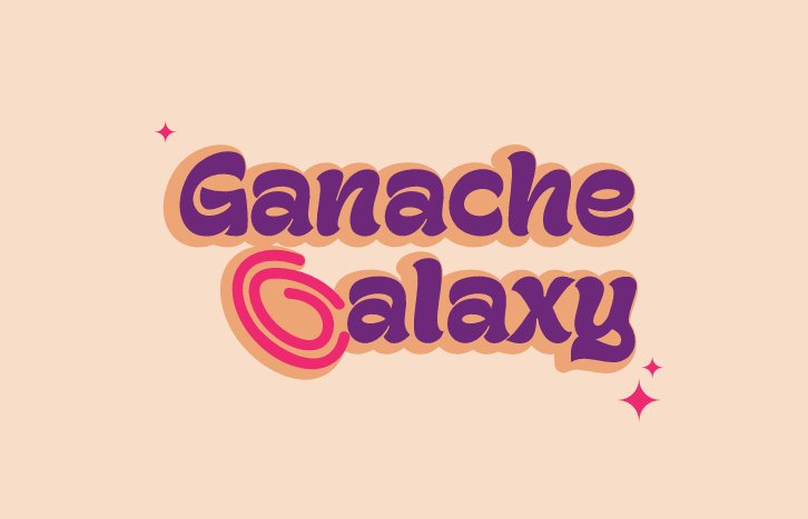
The logo typography uses bold and playful curves to give the brand a friendly and energetic presence, while still maintaining a clean and professional structure for scalability across different platforms. The custom “G” symbol is inspired by the smooth circular motion of flowing ganache, creating a visually satisfying form that also subtly represents the initial of the brand name.
The vibrant pink and deep purple color palette adds a bold, dreamy, and galaxy-inspired aesthetic, helping the brand stand out while creating a strong emotional and visual connection with a younger audience. Small spark elements further enhance the creative and expressive vibe of the identity.
The branding is developed with versatility and scalability in mind, allowing it to work effectively across packaging, social media, merchandise, print, and digital applications while maintaining a strong and recognizable visual presence.
Overall, Ganache Galaxy is not just designed as a logo, but as a complete brand experience — modern, creative, expressive, and memorable. #graphicdesigner