TOQUE - Accessible magazine
Madalena Fontes
Published
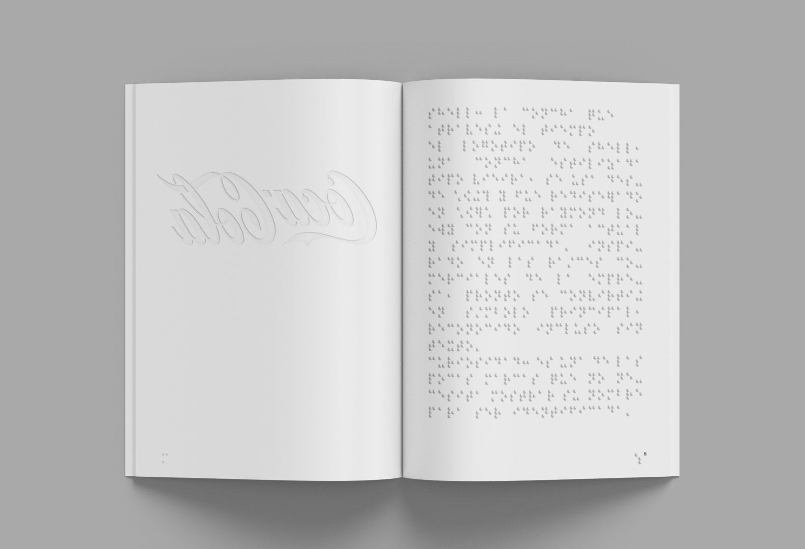
This project aims to make graphic design accessible to everyone, especially people with visual impairments. It consists of a bimonthly magazine that features 10 classic logos, adapted through embossed printing, braille transcription, and the use of color, creating an inclusive sensory experience.
Each edition is built around three core pillars:
Tactile accessibility, through embossing.
Clear visual communication, with legible typefaces and adapted hierarchies.
Aesthetic inclusion, integrating both visual and tactile elements for a diverse audience.
This is a non-profit cultural and social project, whose purpose is to promote accessibility and social awareness within the field of graphic design.
The project’s visual identity reflects its values: inclusive, educational, and cultural. Its key components include:
The bimonthly magazine as the central element;
Complementary communication materials such as a website, outdoor posters, social media,
and a promotional video.
This strategic approach seeks to position the initiative as a benchmark in accessible design, contributing to a more inclusive visual culture.
Keywords: accessibility, braille, graphic design, inclusion, embossing, sustainability, visual culture, visual impairment.