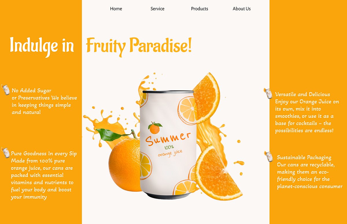
Summer – 100% Orange Juice Landing Page
Manvendra Singh Ranawat
Published
Summer – 100% Orange Juice Landing Page
UI/UX Design by Manvendra Singh
This landing page was designed to bring the vibe of summer to life — fresh, fruity, and full of energy. The goal was to make the product feel fun, healthy, and irresistible at first glance.
Design Goals:
Create a visual identity that feels natural, playful, and premium.
Highlight product benefits clearly and quickly.
Build trust with clean layout and appealing messaging.
Key Features:
Split-Screen Layout
A modern, engaging format where the product is visually centered, and the benefits are distributed for easy scanning.
Vibrant Color Palette
Bright orange and white dominate the visual language, reflecting energy, freshness, and citrusy goodness.
Typography
Handwritten-style headline font for a fun, relaxed feel paired with a clean sans-serif for body text to keep things readable.
Product-Centric Imagery
The juice can is showcased with splashing orange visuals and fresh fruit, giving the design an immersive feel.
Clear Value Propositions
• No added sugar or preservatives
• 100% real juice packed with nutrients
• Can be used as a base for smoothies or cocktails
• Eco-friendly, recyclable packaging
Navigation Simplicity
A minimal header with Home, Service, Products, and About Us to avoid clutter and guide user flow.
Design Style:
Clean, minimal, and friendly
Modern e-commerce feel that could easily be adapted for desktop and mobile views
Emotionally appealing through color, typography, and imagery
Ideal For:
Juice or beverage startups
Healthy food brands
Eco-conscious product marketing
Summer seasonal campaigns