DUSK
Rohit R
Published
DUSK, small-batch dark chocolate
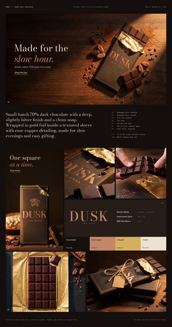
DUSK is a fictional small-batch dark chocolate brand I created and art-directed as a practice e-commerce campaign. The product is a 70% dark chocolate bar with a deep, slightly bitter finish and a clean snap, wrapped in gold foil inside a textured near-black sleeve with rose-copper detailing.
I made it the deliberate opposite of a bright product shoot: warm, dark and slow, lit like the last hour of daylight. The copper foil, the embossed wave pattern and the cacao pod illustration carry the premium feel, and the close-ups of the snap and the glossy squares make you want to taste it. I took the packaging through several rounds until it looked like real dark chocolate rather than a generic bar.
The set covers a desktop hero banner (“Made for the slow hour.”), a mobile hero banner (“One square at a time.”), a foil and texture macro, the snap, the bar on foil for product pages, a gift stack for seasonal campaigns, and a palette and type system. The sleeve design stays consistent in every shot, so the brand reads the same from a banner to a close-up.
Tools: Google Flow for imagery, with Claude as a prompting and layout assistant. Concept and art direction by me.