Stackwell: SaaS Dashboard Redesign Concept
SANHEE LEE
Published
0
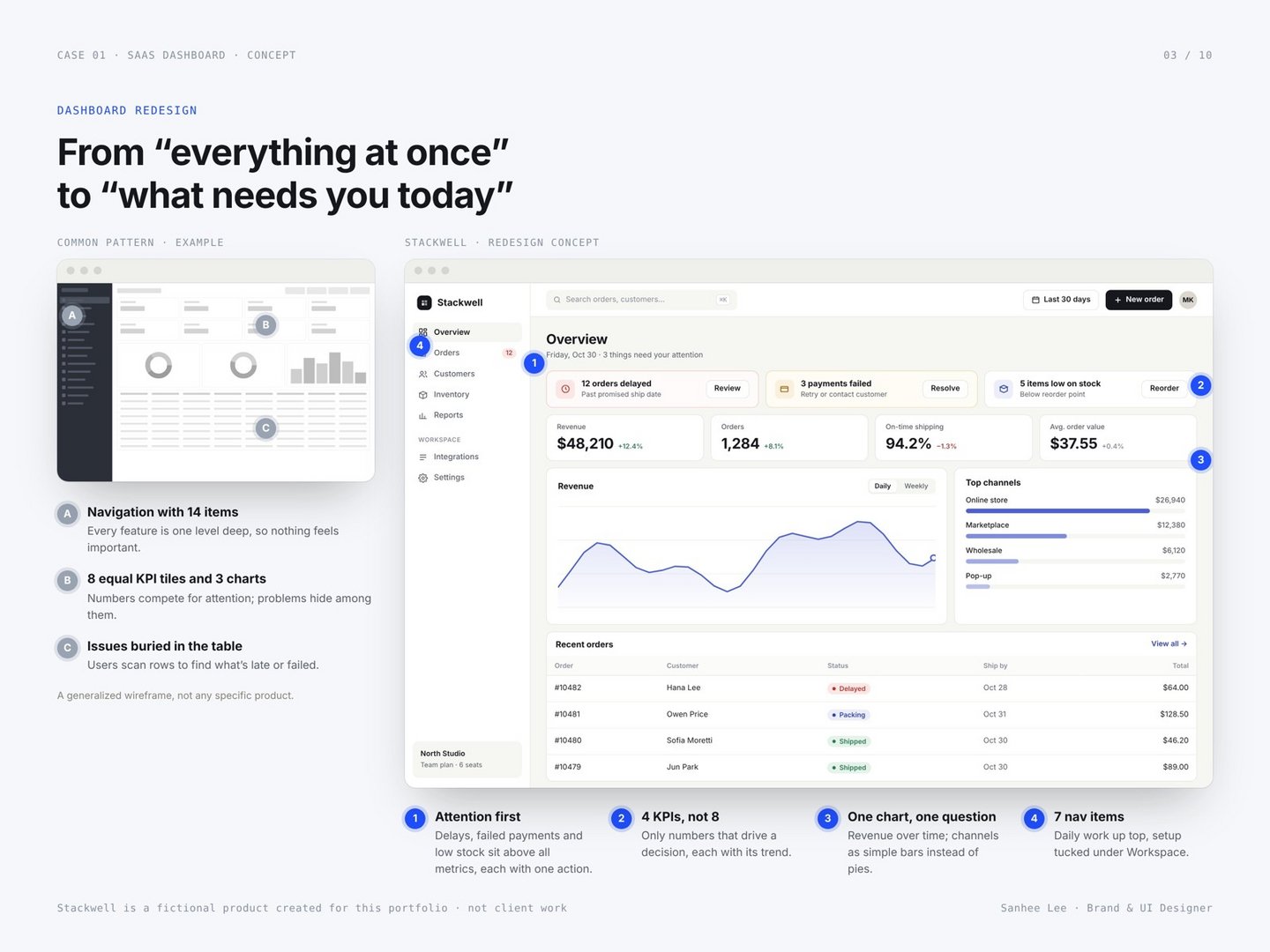
The problem: A common e-commerce dashboard shows everything at once: 14 navigation items, 8 equal KPI tiles and issues buried in tables.
What I changed
- Attention first: delays, failed payments and low stock sit above all metrics, each with one action
- 4 KPIs, not 8: only numbers that drive a decision, each with its trend
- One chart, one question: revenue over time, channels as simple bars
- 7 nav items: daily work up top, setup tucked under Workspace
Result: A dashboard that shows “what needs you today” instead of “everything at once.”
Stackwell is a fictional product created for my portfolio, not client work.