UNDERTOW
Tabitha Terwase
Published
UNDERTOW — Cover Design
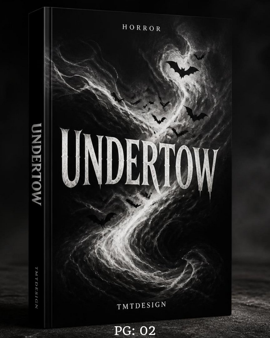
A monochrome storm rendered as narrative: a single current of pale smoke cuts through pure black, twisting down the spine like something pulling a body under. Bats scatter along its path — not decoration, but momentum, as if the shape itself is fleeing something the viewer can’t see yet. The title sits dead-center in a distressed, dripping serif that looks carved rather than typed, heavy enough to anchor the composition without fighting the swirl around it.
Full black-and-white restraint was the discipline here — no color to lean on, no shortcuts to mood. Just value, contrast, and a current that drags the eye from top to bottom in one unbroken motion. It’s a cover built for the shelf and the thumbnail alike: legible at a glance, unsettling on a second look.