Orbita: Travel Planning Website Concept (UI/UX Design)
Victory Okafor
Published
0
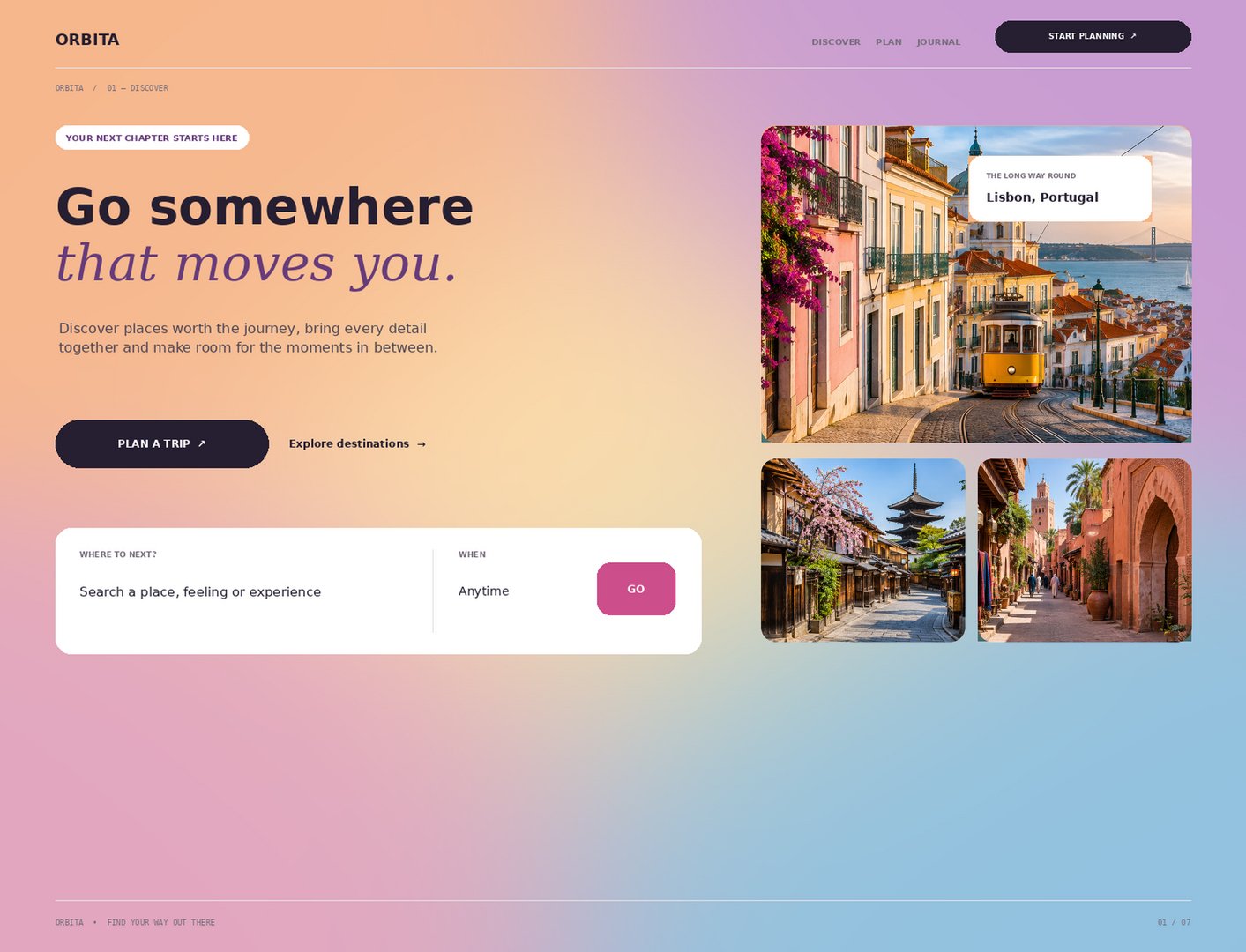
Orbita is a travel discovery and trip-planning website concept that helps people find places worth the journey and plan every detail in one calm, inspiring space. This landing page design focuses on making travel feel emotional first and practical second.
The brief
Design a landing page that turns browsing into planning, with a clear path from inspiration to booking a trip.
Design approach
- Brand and tone: a warm sunset gradient (peach, lilac and sky blue) with a bold sans-serif headline paired with an italic serif accent (“that moves you.”), giving the brand a human, editorial voice.
- Hero and messaging: a short, emotional headline, one supporting line and a clear primary action (“Plan a trip”) with a lighter secondary action (“Explore destinations”).
- Search experience: a simple search card (“Where to next?” and “When”) that accepts a place, feeling or experience, with one high-contrast “Go” button.
- Visual storytelling: a photo grid of Lisbon, Kyoto and Marrakech with a labelled featured destination card, so visitors see what’s on offer straight away.
- Navigation and layout: minimal navigation (Discover, Plan, Journal), a clear call-to-action button, section numbering and generous white space for easy scanning.
Focus areas
Landing page design, UI design, UX design, web design, travel website design, hero section, call to action, search interface, brand identity, visual hierarchy, colour palette, typography, responsive layout, concept design.