Bar Ties Brand Guidelines
andreaest
Published
THE PROJECT OVERVIEW
The Client: BarTies Mobile Bartending is an Austin, Texas local small business.
The Challenge: The company wanted to create a branding kit that conveyed their luxury bartending persona. It was important that the business have a distinct style that was recognizable by clients no matter the context. The goal was to ensure the brand feel high-end and luxurious, without being flashy or gaudy.
What I Did: I developed their brand personality, logo, style guide, custom filters, and social media templates.
All design choices were done considering they might need to translate into any future products released by the brand. This includes, but is not limited to: glassware, promotion boxes, table linens, uniforms, name tags and a website (both mobile and desktop).
THE DELIVERABLES
Logo Variations:
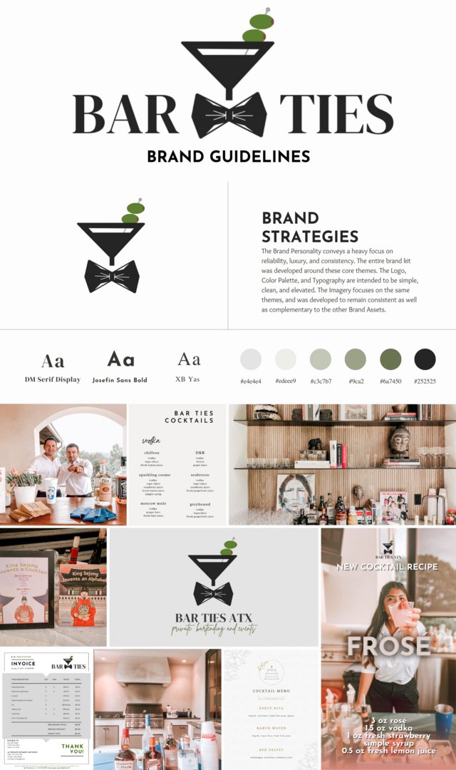
The Logo was designed to convey that the business: specializes in bartending; works high-end, private, black-tie events; and is a luxury service. A martini glass was chosen to emphasize the luxury bartending aspect; the bowtie to convey the black-tie nature of the private events; and lines were kept sharp and geometric in order to reinforce the company’s rigid, consistent professionalism.
The typography: Serif fonts were favored to soften the edges of the logo, as well as convey a sense of class that the owner desired. The single sans serif was selected for headings to complement the logo’s style.
The Color palette: A muted green color palette was chosen to stay consistent with the logo’s pop of color; softer, forest, pastel greens were favored to avoid being too harsh. Stark black and white were avoided completely.
Print and Digital Templates were developed in order to keep the brand’s deliverables consistent. From invoices to Instagram Stories, every aspect of the business was designed to follow brand guidelines and maintain a strong sense of brand identity both on and offline.
The Custom Lightroom filter was developed intentionally with undertones of rose to complement the green-focused color palette of the brand.
The Stationary Templates developed were done for products that needed heavy branding and were more information heavy, like invoices, employee nametags, and business cards.