Raksha
Two weeks after a raise, most founders have a product roadmap and no page to point investors, press, or early users to. A pre-launch landing page fixes that fast: one page, one promise, one way in. The best ones share a small set of structural choices, not a look.
What makes a pre-launch landing page work
A pre-launch page has one job: convert a stranger into a signup before the product exists to prove itself. That means the page has to do the selling a live product would normally do. The strongest examples share four things:
- A single, specific promise above the fold
- Proof that doesn’t depend on the product being live yet (founder credibility, press mentions, a waitlist counter)
- One action, repeated, not a menu of options
- A reason to act now instead of bookmarking it for later
Miss any of these and the page reads like a placeholder, not a pitch.
Examples worth studying
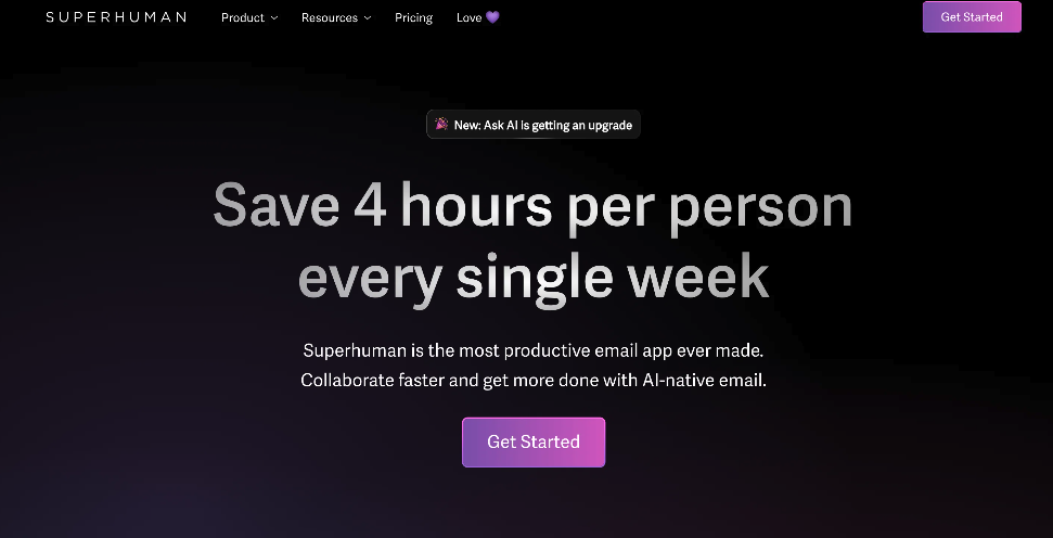
1. Superhuman: exclusivity as the hook
Superhuman’s early landing page didn’t try to explain email software. It sold speed and scarcity: a fast, keyboard-first inbox, available by invite only. The waitlist itself became part of the pitch. Wanting in was the proof the product mattered.
What to steal: if your product has a genuine wait or a limited onboarding capacity, say so. Scarcity only works when it’s real, so don’t manufacture a fake queue.
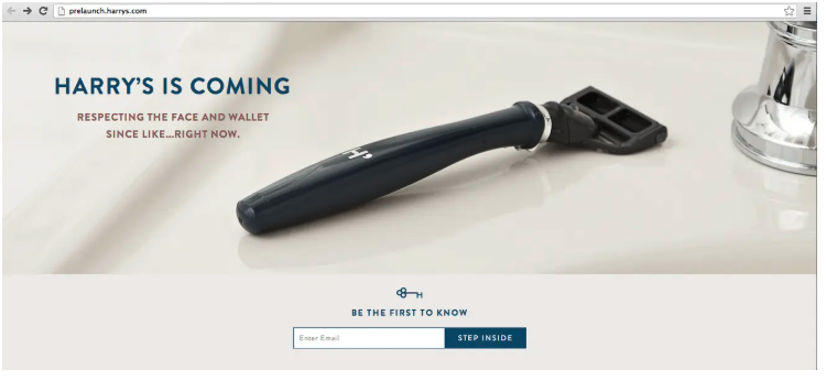
2. Harry’s: the referral-first waitlist
Harry’s launched with a waitlist landing page built around referrals instead of ads. Signing up moved you up the list; referring friends moved you up faster, with prizes for hitting referral thresholds. The page’s only real content was the offer and a live position tracker.
What to steal: a referral mechanic turns your signup page into its own acquisition channel. You don’t need a bigger media budget, you need a reason for someone to send the link to three friends.
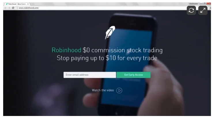
3. Robinhood: the waitlist as market research
Robinhood’s pre-launch page collected emails months before the app existed, then used position-in-line and referral data to gauge real demand before committing engineering time. The page asked for almost nothing: an email, a referral link, a number showing your place in line.
What to steal: a pre-launch page can double as a demand signal for your own team, not just a marketing asset. Track where signups come from so you know which channel to double down on post-launch.
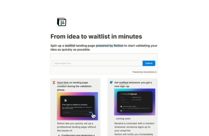
4. Notion: the “coming soon” that showed the product
Rather than hide the interface, an early Notion landing page led with screenshots of the actual tool. No abstraction, no stock photography of people pointing at laptops. The product was the proof.
What to steal: if the interface is genuinely good, show it. Founders who hide the product behind vague copy are usually hiding an unfinished one.
The anatomy of a converting pre-launch page
Strip away the branding and every example above follows the same skeleton:
Section | Job it does |
|---|---|
Headline | States the one outcome, not the feature list |
Subheadline | Names who it’s for and when they’ll need it |
Signup form | One field where possible: email only |
Proof | Founder background, press logos, or a live counter |
Secondary CTA | Share/referral link, or a way to follow progress |
Founders scaling a product team two weeks out from a launch rarely have the design bandwidth to build this properly while also shipping the product itself. That’s usually the moment to assemble a small team for the launch page: a UI designer for the layout, a copywriter for the headline and subhead, and a developer to wire up the waitlist and referral logic. All three specialists can be matched and briefed within 48 hours, which matters when the launch date is already set.
Common mistakes on pre-launch pages
- Too many CTAs. “Join waitlist,” “watch demo,” “follow us on X” all on one page dilutes the single action you actually need.
- Vague headlines. “The future of productivity” tells a visitor nothing. Name the job the product does and who it’s for.
- No urgency mechanic. Without a reason to act today, most visitors bookmark and forget.
- Hiding the product. If the product is real and looks good, show it. Vagueness reads as unfinished, not mysterious.
- Skipping mobile. Pre-launch traffic from a founder’s X post or a press mention is often mobile-first. A page that only works on desktop loses half its signups before the form loads.
Building your own pre-launch page
Start with the outcome, not the design. Write the one sentence your page needs to prove, then build backward: headline states it, subhead qualifies who it’s for, form captures the signup, proof section backs the claim. If the design and copy need to come together fast, match with a specialist team rather than splitting the work across three separate freelance searches. A project-based brief, vetted before you see a profile, gets the page live without adding to headcount you don’t need past launch week.
Once the page is live, the work shifts to conversion: testing headlines, tightening the form, and watching where referral traffic actually comes from. The pages above didn’t get it right on day one either. They iterated fast because the skeleton underneath was already sound.
Final thought
The best pre-launch landing pages aren’t the best-designed ones. They’re the ones that make a single promise, back it with real proof, and ask for one action. Get that structure right first, then spend your remaining time on the polish. If the launch date is fixed and the team isn’t, assemble the specialists you need and get the page live before the deadline, not after it.



 Vicky
Vicky
 Twine
Twine