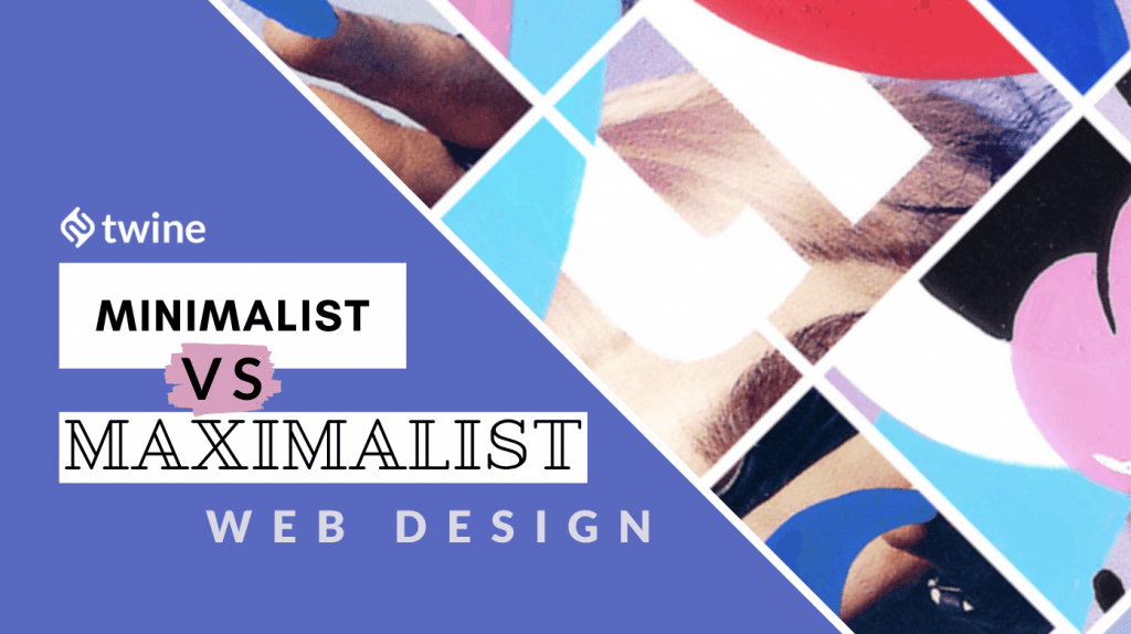
Web design trends impact everything: from the way a user interacts with a website, to the look and feel of the user interface. However, there are two extreme styles that a web designer can consider when approaching a project: minimalism vs. maximalism.
Minimalist web design has gained tremendous popularity over the coming years. Luxury, hospitality, and fashion brands have all taken minimalist web design as the new normal.
Other types of brands – from music to beauty – are turning towards maximalist web design.
If you’re working in the digital space, understanding how web design trends are evolving is crucial.
So, whether you consider yourself a “less-is-more” kinda designer, or prefer to go big with your visuals, we have outlined the basics when it comes to web design. Here are the key pros and cons of minimalist vs. maximalism.
Need a brand new website for your business? Or want to re-design your existing one? Twine has over 20,000 experienced web professionals ready for the task – check out designers & developers here.
What is Minimalism?

By definition, minimalism is a style or technique that is characterized by extreme clarity and simplicity.
As an art movement, minimalism is most associated with American artists of the 60s and 70s. Re-emerging in the 90s, the style was established as a trend that inspires us with a sense of calm and tranquility, after the opulence of postmodernism and deconstructivism.
In other words, minimalism is one of the many web design trends to achieve maximum impact using a minimum amount of elements.
Geometric forms, simple lines, scarcity of elements, neutral colors, clean and simple fonts, and flat backgrounds all exist within the minimalist territory.
Key features of Minimalist Web Design:
1. Distinctive fonts:
In a minimalist website, typography plays a fundamental role.
As they stand alone in the design, fonts should be unique, rare, and appealing. They need to be capable of immediately capturing your user’s focus – whether through bold and interesting shapes, or clean-cut, sharp lines. In a minimalist design, it’s important you avoid too neutral or inconspicuous styles.
2. Neutral and balanced colors:
A lot of minimalist website templates are designed using a monochrome color palette. Bright colors are also acceptable, but you should tread lightly when using them.
Any element of color on a neutral background attracts attention and can become the center of the design – often, by accident. This means bright accents should be used wisely: for example, to highlight a CTA button or for important information.
3. White space:
The battle between minimalism vs. maximalism presents another challenge for web designers everywhere, and that is white space.
White space is the empty and blank areas of the page, which makes it easier for you to navigate the user’s gaze. Similar to strategic coloring, using white space can help accentuate important information, and even contribute to an increase in conversion rate.
Pros of Minimalism

- Keep things simple: Minimalism in web design combines aesthetics and functionality in the simplest way possible. This design only uses the real necessary elements, so the user can navigate without getting distracted. All superfluous elements must be eliminated in order to avoid sidetracking your audience.
- Straightforward: As the old saying goes, “less is more” – with a minimalist design, that has never rang more true. Content can truly shine when paired with minimalism, as it enables you to get your brand message across, quickly and clearly. Whether it’s a blog post or product overview, minimalism helps you say more with less.
- Timesaving: The simplicity of minimalist design supports user navigation. It ensures your content and user interface is simple and intuitive. By reducing the number of visual and interactive elements, you avoid excess information, improved browsing experience of your users, and an increase in loading speed for your website. In the battle of minimalism vs maximalism, it’s sure easier to read and decipher a minimalist website.
CONS of Minimalism
- Not so easy: Don’t confuse minimalist design with easy design. In minimalist design you have to invest – even if it may not seem like it! Surely, less design = less time, right? Wrong. A large amount of time can be spent researching, planning, and testing your desired approach. Although super modern, this type of design is not always suitable for those who are looking to cut time, or expenses.
- Limits communication: Businesses grow and evolve. Often, to succeed you need to adapt, and adding new features to your website may be one of the ways. With minimalism, additonal material doesn’t always work very well. As a design style, minimalism limit flexibility. It forces you to eliminate everything but the fundamentals. Your challenge – should you choose to accept it – will be to fight for each new element that needs to be added. If an element doesn’t fit well into the established structure, this task may be even harder.
- Under the magnifying glass: When a website is designed in the minimalist style, the smallest mistake can be significantly noticed. So, if you decide to lean towards a minimalist website design, be prepared for criticism. Keeping things too simple, without an expert helping you along the way, can mean a website can become boring. It also may mean that you aren’t offering enough value or information for users to stick around, and find what they’re looking for.
What is Maximalism?

Maximalism is a trend that emerged between the end of the 20th century and the beginning of the 21st. Contrary to minimalism, maximalism glorifies elements through a mixture of styles, colors, and tones.
In a nutshell, maximalism evokes the ethos “the more, the better”, instead of “the less”.
The idea when using a maximalist approach is to wow your users by giving them everything they need, plus a little extra. Whether it’s flashing text, bold images, or outstanding videos – maximalism welcomes them all.
While some users may feel overwhelmed by a maximally designed interface, when done correctly and refined to be approachable; a well-designed maximalist website can easily draw visitors in. Over time, these visitors can turn into regular customers.
Where minimalism is quiet and smooth, maximalism is loud and textured. The minimalism vs maximalism debate is never-ending, as they’re such polar opposites!
Key features of Maximalism Web Design

1. Mix and match fonts:
Maximalism loves the mix of not only textures and colors, but also typography styles. Where minimalist web designs may seek to use simple stuff, maximalism isn’t afraid to use a myriad of fonts. The goal with maximalism is to experiment with perspective, dimension, and scale to create a strange and unbalanced experience.
2. Clashing colors:
Perhaps the most noticeable attribute of maximalism is the use of bold color schemes. The more conflicting, the better. As colors can be combined to create new and exciting compositions, the opportunities to explore interesting new designs are limitless. Instead of muted neutrals, maximalism uses eccentric hues to achieve a feeling of “organized chaos“.
3. Bold textures:
While minimalism is about smoothness and uniformity, maximalism is about shaking the senses. Maximalism places uneven textures and patterns next to each other to create complexity within the design. Through layering, repetitive clashing patterns, and blending styles, this design style can be easily achieved.
PROS of Maximalism

- Spontaneity: In the battle of minimalism vs. maximalism, minimalism speaks to us in a calm, and often serious, tone. This design style is useful when paired with mature labels that are looking to offer trust – think skincare, or hygeine brands.
Maximalism, on the other hand, screams and breaks free from the constraints, leaving room for spontaneity. This is particularly valuable if your brand is emulating “youth” culture – think musicians, agencies, and fashion labels.
- One-of-a-kind: Maximalism not only focuses on mixing colors and textures, but also creates new combinations – like collage. This helps attract attention, and ultimately, make your website stand out from the crowd. If you look across a selection of minimalist websites on the other hand, there’s often little to distinguish them.
- Loud and clear: A simple approach may not do justice to a brand’s potential and personality if it has a lot to communicate. The maximalist style places no restrictions on the number of elements that can be used, urging you to make your design as loud as possible. Maximalism has objectively more aggressive aesthetics, whereas minimalism may offer a weak portrayal of what a company stands for.
CONS of Maximalism
- Crowded text: As there is no limit on design elements, maximalism can often be perceived as too much. Just because you are granted creative freedom, doesn’t mean you should throw everything at a page in the name of art! Some practices can help your maximalist design stand out, i.e. using a structured visual hierarchy or contrast to bring attention to different sections.
- Unsettling colors: Unfortunately, maximalist color combinations are not for everyone. In fact, there is so much going on in each section, it can be hard to keep everything looking clean and organized. Moreover, users can find it hard to focus on this kind of design, causing them to classify your website as exhausting and visually unpleasant. Yikes…
- Distracting visuals: An overabundance of lines and graphics can make viewing and navigating a maximalist website difficult. Some users are so familiar with visiting plain and simple websites that they may not appreciate complex elements literring their screens. Without a up labeling your website as pointless and overwhelming.
Conclusion
Whether your website is minimal or maximal, your web design needs to be accessible. To be representative of your brand, and enable users to achieve their desired action, there needs to be cohesion between brand and design.
Therefore, before you begin a design project, it’s critical to consider your core mission, and whether it may align with either minimalism or maximalism.
Although they may be at opposite extremes, minimalism vs maximalism both offers significant advantages. What do you think – are you ready to design a website?
Ready to hire? Our marketplace of over 410,000 diverse freelancers has the skills and expertise needed to skyrocket your business. From marketers to designers, copywriters to SEO experts – browse the talented bunch here!