As investor pitches only last a matter of minutes, you only have a small space of time to grab the attention of your investor and keep it – this is where these handy pitch deck examples come in.
It’s a bit like speed dating: your investor sees tons of pitches every week, so, how do you make yours stand out? A great pitch deck example can help you do this.
It’s natural to look to other startups who have successfully raised money and think “How did they do that?”, well, part of their success is usually down to how good their pitch or slide deck was. Investment rests on how well you can communicate your idea, so a good pitch deck will help you do this in a clear and simple way.
Get it right and it can help secure your future. Get it wrong and the investor will forget you the minute you walk out the door…
But first… what is a Pitch Deck?
A pitch deck is a presentation that’s usually made of anywhere between 10 and 30 slides, designed to give a short summary of your vision, business plan, and your company overall. Once you know how to make a pitch deck, it will come in handy in a multitude of situations – not just a meeting with a new investor.
A pitch deck template usually has the following data: problem, solution, competition, figures, the team, etc… So, if they all have similar content, what makes one better than another? That lies in the way the information within the pitch deck templates, is presented. Enter: the Design.
Good design will make your pitch deck sink or swim. Daniel Eckler, founder of Mylo puts it nicely:
Compare it to wearing a tie and pressed button up to a job interview: it won’t get you the job, but it will prevent you from having to dig yourself out of the hole a wrinkled tee and cargo shorts would have created
We’ve collected 101+ startup pitch deck examples that raised over $17 billion across various industries to help you create the best pitch deck possible. Each example includes how much the company raised with that pitch deck, giving you insight into what investors found compelling.
👉 Access 101 Real Startup Pitch Decks
SaaS & Enterprise Software
1. Airbnb
Airbnb used this startup pitch deck to secure funding for their Series B round in 2011. Focused at just 10 slides, each contained bite-sized, visually consistent info. They kept slides sparse yet impactful, using minimal text, smart use of negative space, and simple but on-brand graphics to stand out.
📈 Amount Raised: $600,000 (Seed)
🔗 Read the Deck Analysis + Download the Full PDF
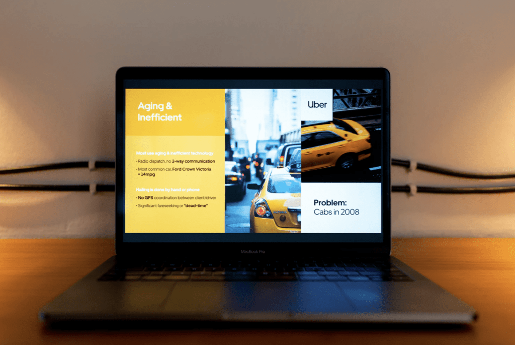
2. Uber (UberCab)
Uber’s pitch deck showcased a forward-thinking vision despite the limitations of mobile tech in 2008. It combined data-driven insights with a futuristic product vision, helping investors understand both their ambition and the opportunity size.
📈 Amount Raised: $200,000 (Seed)
🔗 Read the Deck Analysis + Download the Full PDF
3. Buffer
📈 Amount Raised: $500,000 (Seed)
🔗 Read the Deck Analysis + Download the Full PDF
4. Mixpanel
Mixpanel’s 10-slide deck was a masterclass in clarity. Their use of bold color backgrounds and minimal graphics ensured each point landed cleanly. Typography carried the message, while visuals and consistency showed professionalism and confidence.
📈 Amount Raised: $65 million (Series B)
🔗 Read the Deck Analysis + Download the Full PDF
5. Mattermark
📈Amount Raised: $6.5 million (Series A)
🔗Read the Deck Analysis + Download the Full PDF
6. Front
📈 Amount Raised: $10 million (Series A)
🔗 Read the Deck Analysis + Download the Full PDF
7. Intercom
📈 Amount Raised: $23 million (Series B)
🔗 Read the Deck Analysis + Download the Full PDF
8. Zuora
📈 Amount Raised: $115 million (Series D)
🔗 Read the Deck Analysis + Download the Full PDF
9. Docsend
📈 Amount Raised: $1.7 million (Seed)
🔗 Read the Deck Analysis + Download the Full PDF
10. Shopify
📈 Amount Raised: $7 million (Series A)
🔗 Read the Deck Analysis + Download the Full PDF
11. Slack
📈 Amount Raised: $43 million (Series C)
🔗 Read the Deck Analysis + Download the Full PDF
12. Dropbox
📈 Amount Raised: $10 million (Seed)
🔗 Read the Deck Analysis + Download the Full PDF
13. LinkedIn
📈 Amount Raised: $10 million (Series B)
🔗 Read the Deck Analysis + Download the Full PDF
14. Box
📈 Amount Raised: $15 million (Series B)
🔗 Read the Deck Analysis + Download the Full PDF
15. Notion
📈 Amount Raised: $10 million (Series A)
🔗 Read the Deck Analysis + Download the Full PDF
Fintech
16. Square
Square stood out by making their deck feel like their product: clean, modern, and elegant. Their deck mirrored the simplicity of their hardware and UI design. Data was minimal but precise, and visual consistency built instant credibility.
📈 Amount Raised: $10 million (Series A)
🔗 Read the Deck Analysis + Download the Full PDF
17. Coinbase
Coinbase positioned themselves as the PayPal of crypto—when no one understood crypto. Their clean blue visuals, emphasis on trust, and early traction metrics created a compelling case during the Bitcoin “wild west” era.
📈 Amount Raised: $600,000 million (Seed)
🔗 Read the Deck Analysis + Download the Full PDF
18. Robinhood
📈 Amount Raised: $3 million (Seed)
🔗 Read the Deck Analysis + Download the Full PDF
19. Stripe
📈 Amount Raised: $2 million (Seed)
🔗 Read the Deck Analysis + Download the Full PDF
20. Klarna
📈 Amount Raised: $26 million (Series B)
🔗 Read the Deck Analysis + Download the Full PDF
21. Chime
📈 Amount Raised: $14 million (Series A)
🔗 Read the Deck Analysis + Download the Full PDF
22. Revolut
📈 Amount Raised: $1.5 million (Seed)
🔗 Read the Deck Analysis + Download the Full PDF
23. Monzo
📈 Amount Raised: $7 million (Series A)
🔗 Read the Deck Analysis + Download the Full PDF
24. Affirm
📈 Amount Raised: $45 million (Series B)
🔗 Read the Deck Analysis + Download the Full PDF
25. Transferwise (now Wise)
📈 Amount Raised: $6 million (Series A)
🔗 Read the Deck Analysis + Download the Full PDF
Healthcare & Biotech
26. Oscar Health
Oscar didn’t look like a health insurer—and that was the point. Their pitch deck was friendly, clean, and humanized complex insurance systems. Their UX focus was clear, even in the design of their slides.
📈 Amount Raised: $6 million (Series A)
🔗 Read the Deck Analysis + Download the Full PDF
27. 23andMe
23andMe’s deck introduced personal genomics with clarity. Dual revenue models, a growing database of genetic insights, and a team of PhDs made the science digestible and marketable.
📈 Amount Raised: $6 million (Series A)
🔗 Read the Deck Analysis + Download the Full PDF
28. Healx
📈 Amount Raised: $56 million
🔗 Read the Deck Analysis + Download the Full PDF
29. Theranos
📈 Amount Raised: $28.5 million (Series C)
🔗 Read the Deck Analysis + Download the Full PDF
30. Cedar
📈 Amount Raised: $102 million (Series B)
🔗 Read the Deck Analysis + Download the Full PDF
31. Scipher
📈 Amount Raised: $110 million (Series B)
🔗 Read the Deck Analysis + Download the Full PDF
32. Livongo
📈 Amount Raised: $52.5 million (Series D)
🔗 Read the Deck Analysis + Download the Full PDF
33. Ria Health
📈 Amount Raised: $18 million (Series A)
🔗 Read the Deck Analysis + Download the Full PDF
E-commerce & D2C
34. Warby Parker
Warby Parker’s pitch deck was clean, mission-driven, and reflected their stylish brand identity. Their design made them stand out as a lifestyle brand, not just a retail company. Visual storytelling paired with a strong social impact message created instant investor interest.
📈 Amount Raised: $12 million (Series A)
🔗 Read the Deck Analysis + Download the Full PDF
35. Dollar Shave Club
Dollar Shave Club emphasized their viral approach and customer convenience. Their deck showcased strong unit economics and simplicity, combined with humor—a rare but effective tone in pitch presentations.
📈 Amount Raised: $1 million (Seed)
🔗 Read the Deck Analysis + Download the Full PDF
36. Glossier
📈 Amount Raised: $8.4 million (Series A)
🔗 Read the Deck Analysis + Download the Full PDF
37. Allbirds
📈 Amount Raised: $7.25 million (Series A)
🔗 Read the Deck Analysis + Download the Full PDF
38. Casper
📈 Amount Raised: $13.1 million (Series A)
🔗 Read the Deck Analysis + Download the Full PDF
39. Away
📈 Amount Raised: $8.5 million (Series A)
🔗 Read the Deck Analysis + Download the Full PDF
40. Everlane
📈 Amount Raised: $5 million (Series A)
🔗 Read the Deck Analysis + Download the Full PDF
41. Belgian Boys
📈 Amount Raised: $7 million
🔗 Read the Deck Analysis + Download the Full PDF
42. Rent the Runway
📈 Amount Raised: $15 million (Series B)
🔗 Read the Deck Analysis + Download the Full PDF
43. Harry’s
📈 Amount Raised: $122.5 million (Series D)
🔗 Read the Deck Analysis + Download the Full PDF
Marketplaces & Platforms
44. DoorDash
DoorDash simplified their logistics-heavy idea with visual storytelling: delivery zones, icon flows, and algorithmic clarity. Their consistent red theme built brand recall even within the pitch deck.
📈 Amount Raised: $7.25 million (Series A)
🔗 Read the Deck Analysis + Download the Full PDF
45. OpenDoor
Opendoor’s deck visualized home buying as e-commerce: instant offers, frictionless experience, speed. Their ability to explain a huge offline process with clean visuals sealed the deal.
📈 Amount Raised: $10 million (Series A)
🔗 Read the Deck Analysis + Download the Full PDF
46. Postmates
📈 Amount Raised: $5 million (Series A)
🔗 Read the Deck Analysis + Download the Full PDF
47. Verishop
📈 Amount Raised: $40 million (Series B)
🔗 Read the Deck Analysis + Download the Full PDF
48. EZ Farming
📈 Amount Raised: $105K (Seed)
🔗 Read the Deck Analysis + Download the Full PDF
49. Twine
📈 Amount Raised: $1+ million
🔗 Read the Deck Analysis + Download the Full PDF
50. LawTrades
📈 Amount Raised: $2.7 million
🔗 Read the Deck Analysis + Download the Full PDF
51. Totspot
📈 Amount Raised: $1.8 million (Seed)
🔗 Read the Deck Analysis + Download the Full PDF
52. Fiverr
📈 Amount Raised: $15 million (Series B)
🔗 Read the Deck Analysis + Download the Full PDF
53. Rover
📈 Amount Raised: $12 million (Series C)
🔗 Read the Deck Analysis + Download the Full PDF
Consumer Apps & Social
54. Snapchat
Snapchat’s youthful, playful tone showed through their slides. They ditched formal design for big visuals and simple concepts. Their ghost mascot and vibrant charts made it clear: this was no typical social app.
📈 Amount Raised: $13.5 million (Series A)
🔗 Read the Deck Analysis + Download the Full PDF
55. Twitter
Twitter framed their platform as a new form of communication. Their deck focused on virality, simplicity, and usage among media and tech influencers—foreshadowing their eventual media dominance.
📈 Amount Raised: $5 million (Series A)
🔗 Read the Deck Analysis + Download the Full PDF
56. TikTok (Musical.ly)
📈 Amount Raised: $16.6 million (Series B)
🔗 Read the Deck Analysis + Download the Full PDF
57. Tinder
📈 Amount Raised: $50 million
🔗 Read the Deck Analysis + Download the Full PDF
58. Almabase
📈 Amount Raised: $100K
🔗 Read the Deck Analysis + Download the Full PDF
59. Alumnify
📈 Amount Raised: $1.3 million
🔗 Read the Deck Analysis + Download the Full PDF
60. Facebook
📈 Amount Raised: $13.8 billion
🔗 Read the Deck Analysis + Download the Full PDF
61. LinkedIn
📈 Amount Raised: $10 million
🔗 Read the Deck Analysis + Download the Full PDF
62. Lunch Club
📈 Amount Raised: $4 million
🔗 Read the Deck Analysis + Download the Full PDF
Gaming
63. Sandbox VR
Sandbox VR’s pitch deck made futuristic VR gaming feel tangible. By showing real customers in immersive play, the slides demonstrated social engagement and high replay value. The consistent futuristic design matched their product promise.
📈 Amount Raised: $68 million (Series A)
🔗 Read the Deck Analysis + Download the Full PDF
64. Hadean
Hadean pitched a high-tech backend for the metaverse, emphasizing scalability and real-time simulation. The slides were deeply technical yet clear—appealing to both infrastructure investors and gaming futurists.
📈 Amount Raised: $30M (Series A)
🔗 Read the Deck Analysis + Download the Full PDF
65. Osso VR
📈 Amount Raised: $66 million (Series C)
🔗 Read the Deck Analysis + Download the Full PDF
66. Juked
📈 Amount Raised: $800K (Pre-Seed)
🔗 Read the Deck Analysis + Download the Full PDF
67. SolChicks
📈 Amount Raised: $57 million (Series A)
🔗 Read the Deck Analysis + Download the Full PDF
Hardware & IoT
68. Peloton
Peloton’s pitch combined connected fitness hardware with media content. Their recurring revenue model from subscriptions was a standout slide, and the deck captured both product passion and business logic.
📈 Amount Raised: $30 million (Series C)
🔗 Read the Deck Analysis + Download the Full PDF
69. Ring
Ring’s deck clearly communicated its core value: security and peace of mind. Visuals of the product in use, combined with a simple explainer of the neighborhood security network, helped investors instantly understand the problem and solution.
📈 Amount Raised: $4 million (Series A)
🔗 Read the Deck Analysis + Download the Full PDF
70. Dandelion Energy
📈 Amount Raised: $70 million (Series B)
🔗 Read the Deck Analysis + Download the Full PDF
71. Sonos
📈 Amount Raised: $40 million (Series D)
🔗 Read the Deck Analysis + Download the Full PDF
72. GoPro
📈 Amount Raised: $88 million (Series A)
🔗 Read the Deck Analysis + Download the Full PDF
Transportation & Mobility
73. Bird
Bird’s deck focused on elegant design to match its sleek hardware. Their slides used strong visuals and data to make micromobility feel like the future—not a fad. Maps and user adoption slides brought scalability into focus.
📈 Amount Raised: $15 million (Series A)
🔗 Read the Deck Analysis + Download the Full PDF
74. Tesla
Tesla focused on market disruption through tech, battery innovation, and a compelling vision for sustainable transportation. Their deck showcased clear vertical integration and plans to scale from premium to mass-market EVs.
📈 Amount Raised: $40 million (Series C)
🔗 Read the Deck Analysis + Download the Full PDF
75. Lime
📈 Amount Raised: $12 million (Series A)
🔗 Read the Deck Analysis + Download the Full PDF
76. Rivian
📈 Amount Raised: $450 million (Series B)
🔗 Read the Deck Analysis + Download the Full PDF
77. Aurora
📈 Amount Raised: $90 million (Series A)
🔗 Read the Deck Analysis + Download the Full PDF
Food & Delivery
78. Beyond Meat
Beyond Meat blended science and food appeal in their slides. Side-by-side comparisons, environmental benefits, and tasty visuals helped investors believe in plant-based meat for everyone—not just vegans.
📈 Amount Raised: $17 million (Series D)
🔗 Read the Deck Analysis + Download the Full PDF
79. Blue Apron
Blue Apron emphasized solving the everyday dinner dilemma. Their vertically integrated logistics and data-backed recipe personalization were showcased with simple, colorful slides.
📈 Amount Raised: $135 million (Series D)
🔗 Read the Deck Analysis + Download the Full PDF
80. Vori
📈 Amount Raised: $10 million (Series A)
🔗 Read the Deck Analysis + Download the Full PDF
81. Deliveroo
📈 Amount Raised: $25 million
🔗 Read the Deck Analysis + Download the Full PDF
82. HelloBello
📈 Amount Raised: $1.8 million (Seed)
🔗 Read the Deck Analysis + Download the Full PDF
Education & EdTech
83. Coursera
Coursera’s deck made education scalable. Partner logos, learner stats, and marketplace visuals were used to clearly show value for universities and students alike. The slides blended credibility with accessibility.
📈 Amount Raised: $16 million (Series A)
🔗 Read the Deck Analysis + Download the Full PDF
84. Lambda School (now Bloom Institute of Technology)
Lambda’s deck stood out by aligning incentives—students paid only after getting jobs. The slides clearly explained this disruptive model with success metrics and employer partnerships.
📈 Amount Raised: $14 million (Series A)
🔗 Read the Deck Analysis + Download the Full PDF
85. Kangarootime
📈 Amount Raised: $25 million (Series B)
🔗 Read the Deck Analysis + Download the Full PDF
86. Baby Sparks
📈 Amount Raised: $2 million
🔗 Read the Deck Analysis + Download the Full PDF
87. AceUp
📈 Amount Raised: $1.7 million (Seed)
🔗 Read the Deck Analysis + Download the Full PDF
Web3 & Crypto
88. Coinbase
Coinbase’s later-stage deck emphasized institutional trust and security—crucial for crypto’s mainstream adoption. Blue-tone design, security infographics, and user-friendly messaging reassured traditional investors.
📈 Amount Raised: $1.8 million (Seed)
🔗 Read the Deck Analysis + Download the Full PDF
89. Alchemy
Alchemy branded itself the “AWS for blockchain.” Their deck highlighted reliable developer tools and a robust infrastructure, showcasing how they enable Web3 applications at scale.
📈 Amount Raised: $15 million (Series A)
🔗 Read the Deck Analysis + Download the Full PDF
90. Fetch AI
📈 Amount Raised: $40 million (Series A)
🔗 Read the Deck Analysis + Download the Full PDF
91. Sooho
📈 Amount Raised: $4.5 million (Series A)
🔗 Read the Deck Analysis + Download the Full PDF
92. Mysten Labs
📈 Amount Raised: $300 million (Series A)
🔗 Read the Deck Analysis + Download the Full PDF
B2B Services & Enterprise
93. WeWork
Before its IPO unraveling, WeWork’s pitch was a branding masterclass. Beautiful spaces, lifestyle imagery, and big visions built hype around the future of flexible work—backed by seemingly scalable economics.
📈 Amount Raised: $355 million (Series D)
🔗 Read the Deck Analysis + Download the Full PDF
94. HubSpot
Hubspot used educational storytelling to win over investors. Their deck clearly explained inbound marketing, their all-in-one platform, and customer acquisition strategy.
📈 Amount Raised: $12 million (Series B)
🔗 Read the Deck Analysis + Download the Full PDF
95. Zestful
📈 Amount Raised: $1.2 million (Seed)
🔗 Read the Deck Analysis + Download the Full PDF
96. Cloudera
📈 Amount Raised: $5 million (Series A)
🔗 Read the Deck Analysis + Download the Full PDF
97. Asana
📈 Amount Raised: $9 million (Series B)
🔗 Read the Deck Analysis + Download the Full PDF
Health & Wellness
98. Calm
Calm’s pitch felt like its product: clean, minimal, soothing. Their user retention and subscription growth slides reinforced product stickiness, while the visual design evoked peace and clarity.
📈 Amount Raised: $27 million (Series A)
🔗 Read the Deck Analysis + Download the Full PDF
99. Hims & Hers
Hims made health feel modern and approachable. Their deck leaned on clean branding and customer journeys that showed how easily people could access telehealth services.
📈 Amount Raised: $40 million (Series A)
🔗 Read the Deck Analysis + Download the Full PDF
100. Healthjoy
📈 Amount Raised: $12.5 million (Series B)
🔗 Read the Deck Analysis + Download the Full PDF
101. Healthjoy
📈 Amount Raised: $70 million (Series D)
🔗 Read the Deck Analysis + Download the Full PDF
Ready to Build Your Own Pitch Deck?
We’ve shown you 101 real decks that raised billions, now it’s your turn. Whether you’re starting from scratch or improving what you have, remember: the best pitch decks are simple, clear, and focused on what investors care about most.
Need help bringing your deck to life?
Our expert pitch deck designers are here to support you.
👉Get Started with a Pitch Deck Designer
👉Get the deck analysis + exclusive pitch deck template sent to your inbox.