European Ayurveda
Corinna Pfurtscheller
Published
The Challenge
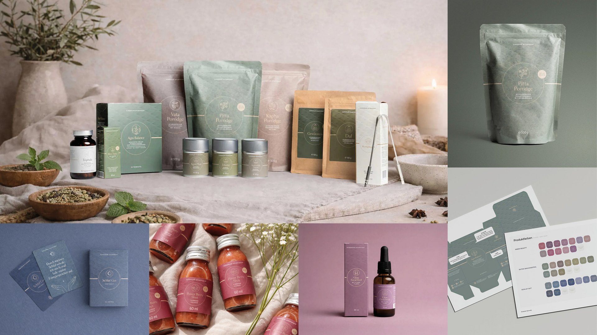
The brand spanned food, beverages, supplements, beauty, and print — across multiple packaging formats — without a cohesive brand or packaging system. It needed to feel premium and holistic while clearly differentiating its product lines.
What I did
I developed a cohesive brand identity and a modular packaging system structured around three distinct color worlds — Sleep, Digestion, and Beauty. Within each program, every product received its own refined shade, creating individual distinction within a controlled visual system. The color architecture is inspired by Ayurveda’s holistic philosophy and translates it into a modern, minimal, premium aesthetic.
The entire framework was codified in a comprehensive style guide to ensure consistent implementation and scalable expansion across future SKUs. #branding #packaging