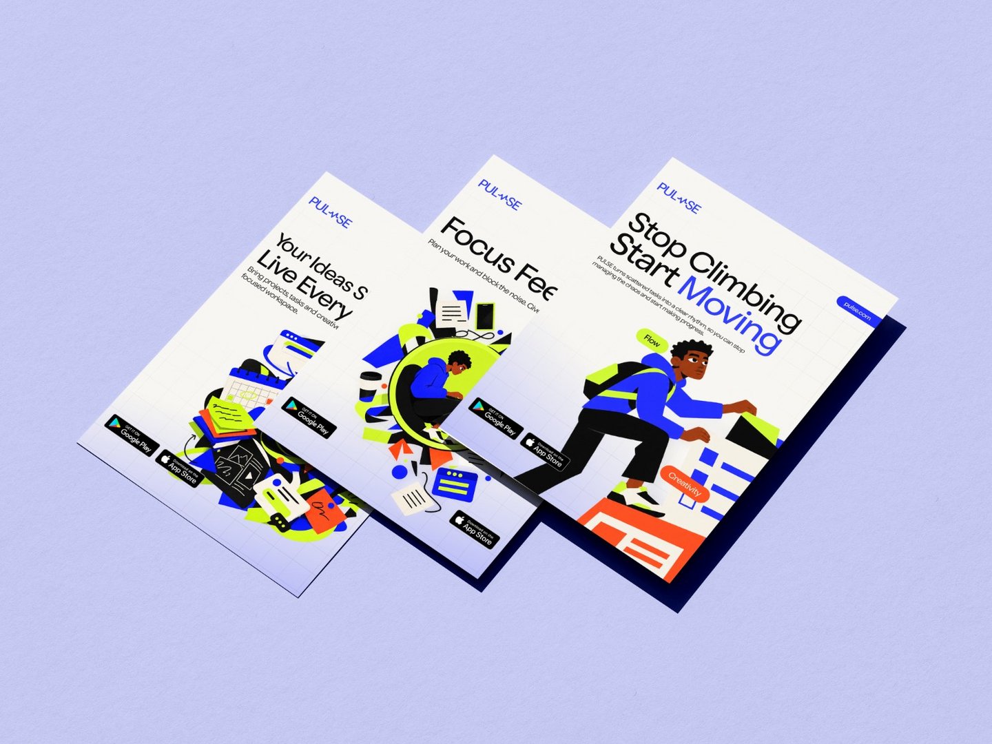
App campaign visuals built to sell relief, not just features - Pulse App Banner Designs
Elizabeth Ogini
Published
The Challenge
Productivity apps are a crowded, skeptical category, most people have already downloaded and abandoned two or three. Pulse needed campaign visuals that could cut through that fatigue by speaking to the actual feeling of a scattered, overloaded workday, rather than leading with another feature list.
The Idea
Every visual centers on the same illustrated character, a stand-in for the user, moving through the emotional stages of disorganization: struggling, distracted, scattered, and finally, in control.
The paper-cutout collage style keeps the tone approachable and human rather than corporate, while the blue, lime, and orange palette on a notebook-grid background ties the whole system to the idea of structured creativity. Each visual leads with a different emotional entry point, but the recurring character makes the campaign instantly recognizable across every post.