Boring Stuff brand identity
Dorsa Masghati
Published
To see the full project go to:
Reimagining the Ordinary: The New Face of Boring Stuff
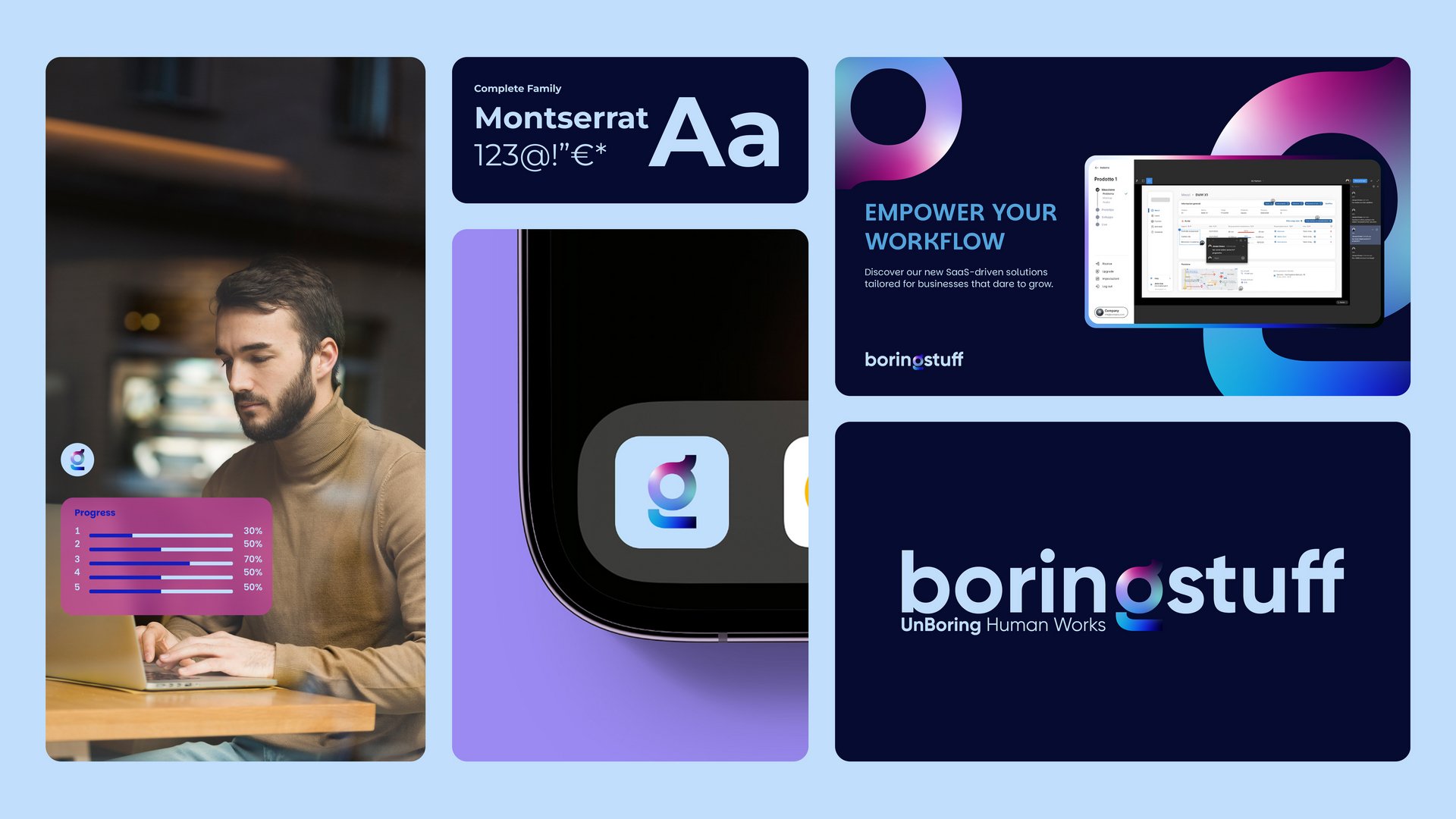
BoringStuff isn’t just about functionality-it’s about making simplicity stand out. For this concept, we embraced a colorful and dynamic visual style, stripping away gradients for a sharper, more contemporary look.
The Montserrat typeface, a longstanding part of the brand’s identity, was chosen for its clarity and confidence, reinforcing a sense of reliability and precision. To inject energy into the visuals, we introduced geometric and distorted shapes, creating a sense of movement that reflects the brand’s tech-driven approach.
Every layout was designed to be clean and structured, maintaining a balance between order and creativity. The result? A bold, modern identity that transforms the “boring” into something undeniably striking and innovative.