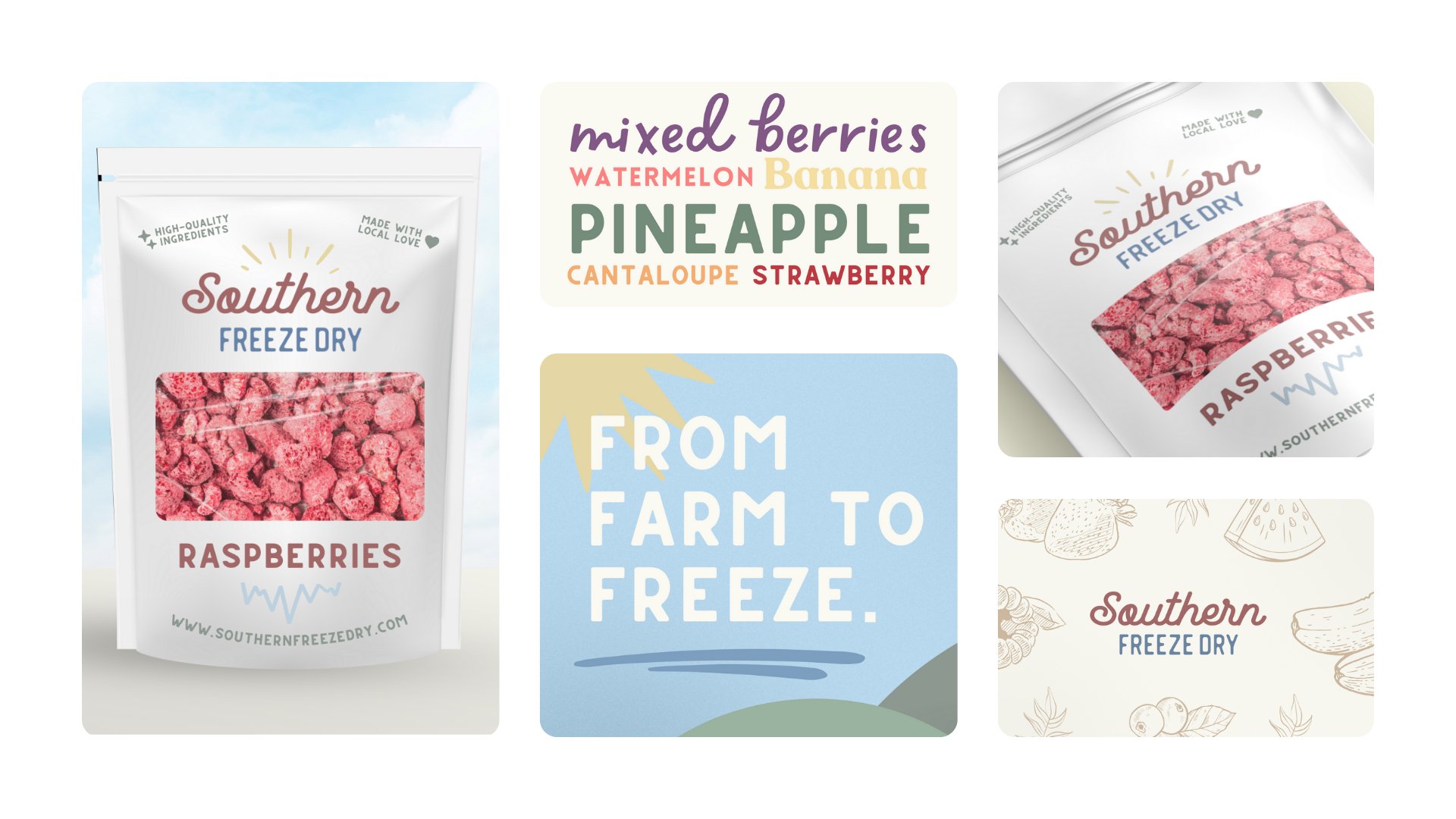
Southern Freeze Dry (Logo, Brand Identity, Packaging)
justinharrisdesigner
Published
Southern Freeze Dry is a venture born out of a quest for high-quality, locally-sourced freeze-dried products. The brand began by offering homemade treats at local farmers’ markets, quickly gaining popularity through word of mouth. As demand grew, the product line expanded to encompass a variety of freeze-dried delights, including fruits, candies and dog treats. With a commitment to preserving Southern flavors and a focus on quality, Southern Freeze Dry has become a staple for those seeking wholesome and naturally preserved treats, catering to a diverse audience across age groups and backgrounds.
The final logo for Southern Freeze Dry achieves a perfect balance of vintage charm and modern appeal. With “Southern” elegantly scripted in dark maroon/brown and “Freeze Dry” in clean, capitalized light blue, the design captures the brand’s warmth and freshness. Organic hand-drawn sunbeams in yellow above evoke Southern sunshine, while simple icicles in light blue below subtly signify the freeze-drying process. This thoughtful combination of colors and elements results in a timeless and inviting logo, symbolizing Southern hospitality, natural goodness, and the brand’s commitment to quality products.
#logo #graphicdesigner #branding #designer #logodesigner #branddesigner #packagingdesigner #brandidentity #packaging #food #snack #ecommerce