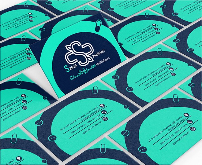
pharmacy branding
momeniza918237
Published
0
Customer priorities in designing this brand: The colors used should remind of healing and health, the word “سروشتی” meaning natural should be used, an element of healing should be incorporated into it.
The result of these features is the design you see.