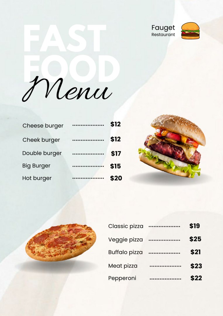
restraunt menu
rakhi92ka7787
Published
This menu was created for a restaurant that serves fast food
offers. I used light colors for the background,
because these colors create a feeling of uniformity and consistency
convey what looks professional and without much effort
allows us to recognize the surroundings based on details.
A professional and clean appearance makes one
good first impression, which can go a long way in improving your reputation
To establish a brand - especially in the early stages, when still
not many people know who you are. As you know, the should
The most important aspect of your menu will be overall readability.
That’s why I use fonts that are easy to decipher -
nothing overly stylized that makes people uncomfortable reading
could make it more difficult. In addition, the eye eats before the mouth, and
professional images on menus give your customers that
Feeling like they are already trying the dish. Just imagine
a menu without pictures. Finally, she mediates
additional information and increases sales. #webdesigner #branding #graphicdesigner #photo #designer #logo