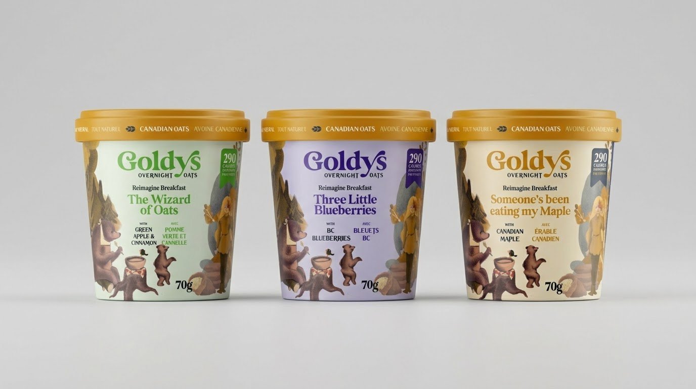
Gold's Overnight Oats - Brand + Packaging
Aaron Armstrong
Published
his project focused on developing a cohesive packaging system for Goldy’s that brings together brand personality, product clarity, and a distinctive visual language across a range of offerings. The objective was to create packaging that feels modern, approachable, and consistent while standing out clearly in competitive retail environments.
Design Approach
The design approach centres on a structured layout system that prioritizes clarity and hierarchy. Typography is used as the primary anchor, guiding the viewer through brand name, product name, and supporting details in a clear and intentional way.
Colour plays a key role in differentiating variants while maintaining a unified brand family. A controlled palette ensures that each SKU has its own visual identity while still feeling connected to the broader system. Consistency in spacing, alignment, and composition reinforces recognition across the range.
Visual Language
The visual language blends clean typography with bold graphic elements to create a confident and recognizable identity. Composition is carefully balanced to ensure that key information remains legible while still allowing room for expressive design elements.
Subtle use of contrast, scale, and colour relationships helps establish a sense of rhythm across packaging formats. Each design is built to feel cohesive on its own while also contributing to a larger, unified system when viewed together.
Packaging System
A scalable packaging system was developed to support current and future product lines. Defined layout rules, typographic hierarchy, and consistent grid structure allow for flexibility without compromising brand integrity.
This system ensures that new variants can be introduced efficiently while maintaining alignment with the established visual direction. The result is a packaging framework that is both adaptable and consistent across applications.
Summary
The final packaging system for Goldy’s achieves a balance between clarity, consistency, and visual impact. Through a structured approach to layout, typography, and colour, the design delivers a cohesive brand experience that is easy to navigate, visually distinctive, and scalable across a growing product range.
#packagingdesign #brandidentity #visualidentity #graphicdesign #branding #packagingsystem #typography #designsystem