HiFive Chicken - Brand + Packaging + Strategy
Aaron Armstrong
Published
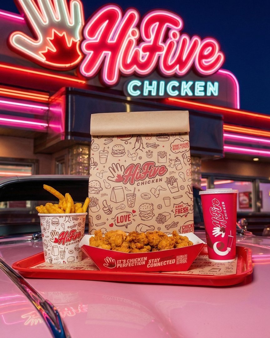
This project focused on developing a bold and playful packaging system for HiFive Chicken that reflects the brand’s energetic personality while maintaining clarity, consistency, and strong shelf presence. The goal was to create packaging that feels fun and approachable, while still clearly communicating product information across a range of offerings.
Design Approach
The design approach centres on a vibrant and expressive visual system built around strong typography, colour, and graphic rhythm. Hierarchy is used intentionally to guide the viewer’s eye, ensuring that key product details are immediately visible and easy to understand.
Colour plays a central role in differentiating menu items and product variations, with each palette selected to feel lively while remaining consistent within the overall brand framework. Repetition of layout structure across packaging formats helps reinforce familiarity and recognition.
Visual Language
The visual language is driven by bold typography, high contrast colour combinations, and graphic elements that support the brand’s energetic tone. Layouts are composed to feel dynamic without sacrificing readability, balancing personality with function.
Illustrative and graphic components are used selectively to add character and reinforce the brand’s identity. These elements are integrated into the system in a way that complements the typography rather than competing with it, resulting in a cohesive and unified look across all applications.
Packaging System
A structured packaging system was developed to allow for flexibility across multiple products while maintaining consistency. Grid-based layouts, defined typographic hierarchy, and repeatable composition rules ensure that new items can be introduced without disrupting the overall visual language.
This system supports scalability while preserving a recognizable identity across the range. Each package feels distinct enough to differentiate products, yet consistent enough to be clearly part of the same brand family.
Summary
The final packaging system for HiFive Chicken combines bold visual expression with clear structure and consistency. Through the use of colour, typography, and a unified layout approach, the design delivers packaging that is engaging, easy to navigate, and adaptable across a growing product lineup.
#packagingdesign #brandidentity #visualidentity #graphicdesign #branding #typography #packagingsystem #designsystem