Tomorrow Networks: UI and Brand Design
serrasemi
Published
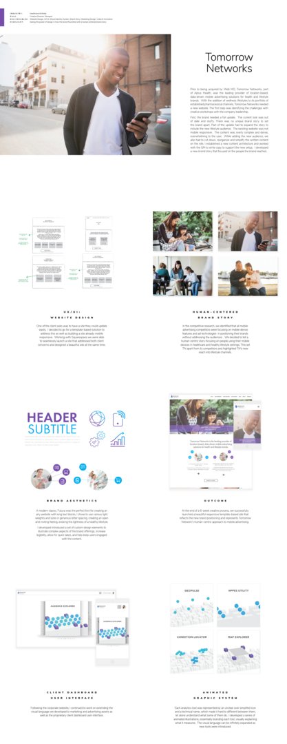
Prior to being acquired by Web MD, Tomorrow Networks, part of Aptus Health, was the leading provider of location-based, data-driven mobile advertising solutions for health and lifestyle brands. With the addition of wellness lifestyles to its portfolio of established pharmaceutical channels, Tomorrow Networks needed a new website. The first step was identifying the challenges with creative workshops with the company leadership.
The brand needed a full update. The current look was out of date and stuffy. There was no unique brand story to set the brand apart. Part of the update had to expand the story to include the new lifestyle audience. The existing website was not mobile-responsive. The content was overly complex and dense, overwhelming to the user. While adding the new audience, we also had to cut down, reorganize and simplify the written content on the site. I established a new content architecture and worked with the GM to write copy to support the new setup. I developed a new brand story that focused on the people the brand reached.
One of the client asks was to have a site they could update easily. I decided to go for a template-based solution to address this as well as build a site already mobile responsive. With Squarespace we were able to seamlessly launch a site that addressed both client concerns and designed a beautiful site at the same time.
We identified that all mobile advertising competitors were focusing on mobile device features and ad technologies in positioning their brands without addressing the audiences. We decided to tell a human-centric story focusing on people using their mobile devices in healthcare and healthy lifestyle settings. This set TN apart from its competitors and highlighted TN’s new reach into lifestyle channels.
A modern classic, Futura was the perfect font for creating an
airy website with long text blocks, creating an open and inviting feeling, evoking the lightness of a healthy lifestyle.
I developed introduced a set of custom design elements to illustrate complex aspects of the brand offerings, increase legibility, allow for quick takes, and help keep users engaged with the content.
At the end of a 6-week creative process, we successfully
launched a beautiful responsive template-based site that reflects the new brand positioning and represents Tomorrow Network’s human-centric approach to mobile advertising.
Following the corporate website, I continued to work on extending the visual language we developed to marketing and advertising assets as well as the proprietary client dashboard user interface.
Each analytics tool was represented by an unclear over simplifed icon and a technical name, which made it hard to different between them, let alone understand what some of them do. I developed a series of animated illustrations, essentially branding each tool, visually explaining what it measures. The visual language can be infinitely expanded as new tools were introduced.