Brand Identity of Orange Planet
Kavya Shah
Published
Overview:
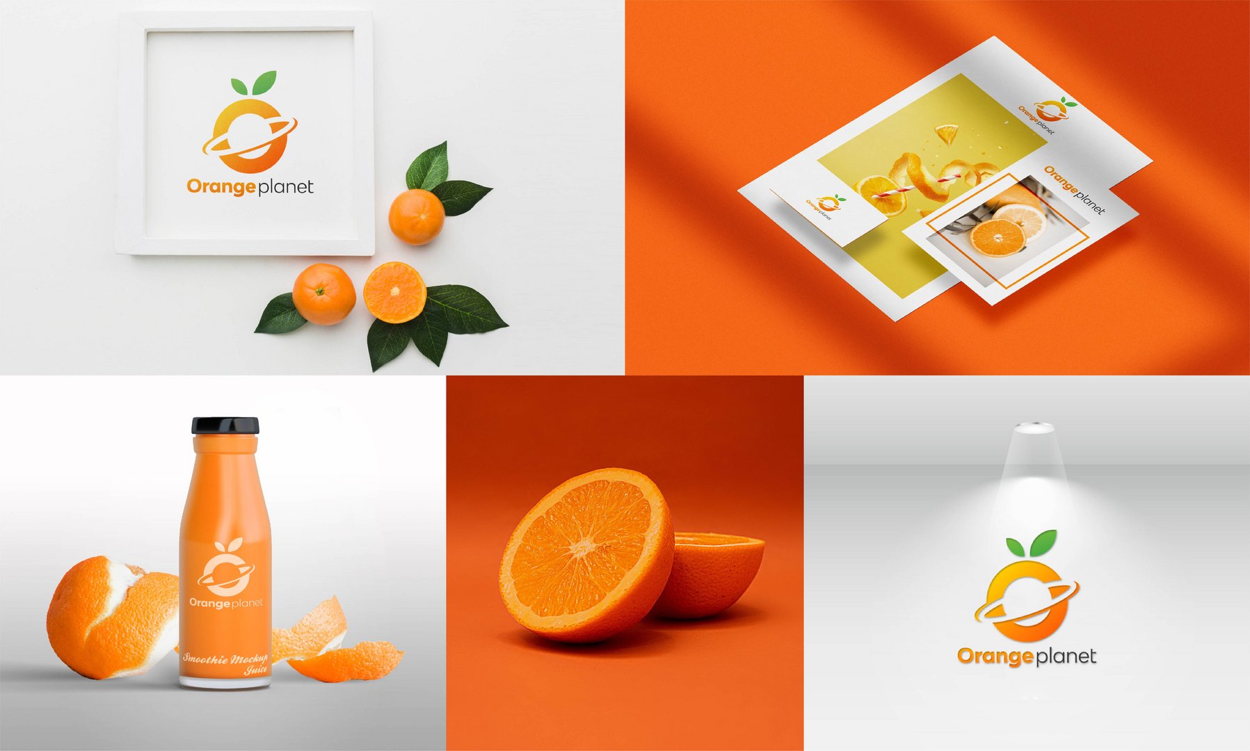
Orange Planet is a fresh and vibrant brand that merges the themes of natural fruit goodness with a cosmic twist. The brand identity revolves around an orange fruit stylized as a planet with an orbit, symbolizing freshness, vitality, and a sense of universal appeal.
Logo Concept:
The logo features an orange fruit with a ring orbiting it, resembling a planet. The design is modern, minimalist, and visually striking, using a combination of bright orange and green to convey freshness and nature. The typography is clean and elegant, with “Orange” in a bold, warm shade and “Planet” in a sleek black, ensuring readability and brand recognition.
Brand Elements:
Color Palette: Dominated by orange (energy, freshness, vitality) and green (nature, health).
Typography: A modern sans-serif font for a clean, professional look.
Imagery: Realistic orange fruit visuals paired with sleek packaging and branding materials, reinforcing the natural and premium feel.
Applications:
Packaging Design: A juice or smoothie bottle with a minimalist label featuring the logo.
Marketing Materials: Flyers, brochures, and promotional designs using a vibrant orange theme.
Product Photography: High-quality images of oranges and juice to establish a strong brand connection.
Signage and Branding: A versatile logo that works well in both digital and print media.
Target Audience:
Health-conscious consumers, fruit juice lovers, and individuals seeking fresh and natural products with a modern, trendy brand aesthetic.
This identity is perfect for a juice brand, organic food line, or a wellness brand that values fresh, high-quality ingredients.
#photo #logo #branding #graphicdesigner #designer #illustrator #Branddesigner