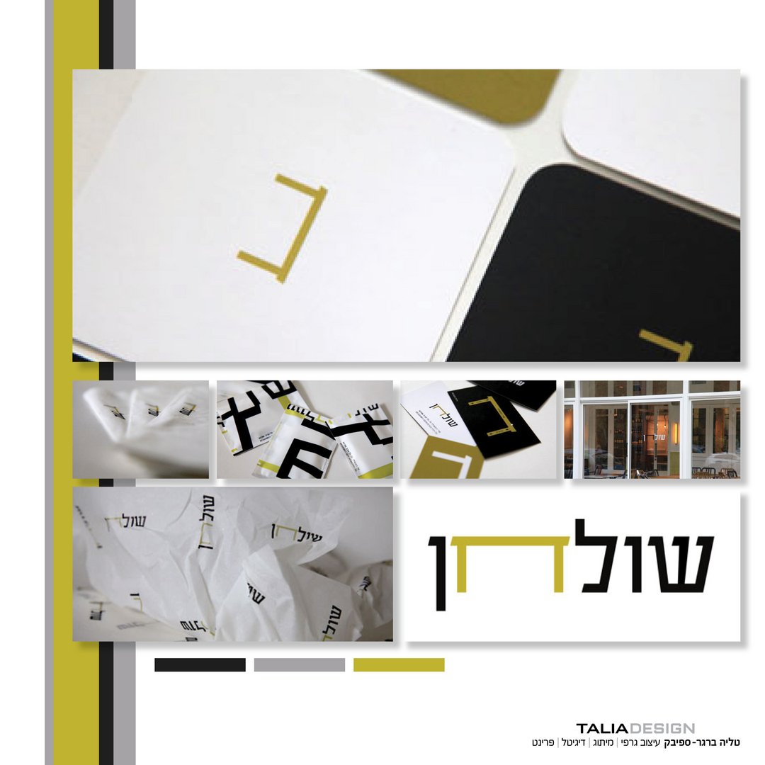
Shulchan (Table) – Chef Restaurant Branding
Talia Berger Spivak
Published
“Shulchan” is a premium chef’s restaurant located in the heart of Tel Aviv’s bustling Rothschild Boulevard. The founders had built an intimate, modern space centered around an open kitchen, featuring a highly curated interior of wood furnishings, marble tables, large windows, and white and light-green ceramics.
Their primary challenge was finding a visual identity that wouldn’t compete with or clutter this carefully balanced physical space. They needed a branding system that could seamlessly bridge two contrasting worlds: the high-end, elegant culinary experience of a chef’s kitchen, and the young, dynamic, urban street vibe of Tel Aviv - all while maintaining absolute visual harmony.
I led the comprehensive graphic branding and visual identity design for the restaurant. Applying a strict “Less is More” philosophy, I created a minimalist graphic language that turned the physical architecture and the brand elements into one homogeneous, elegant experience.
My specific contributions included:
Conceptual Logo Design: I developed a clever, typographic logo where the Hebrew letter “ח” (Het) in the word “Shulchan” (Table) visually doubles as the shape of a table. This created a dynamic identity system where the “ח” could act as a subtle standalone icon or take the lead role alongside the full logotype, depending on the context.
Color Palette Integration: I established a precise color palette of green, black, and white. This was deliberately chosen to complement the interior ceramics and natural wood, ensuring the branding felt like an organic extension of the restaurant rather than an overlay.
Complete Physical Branding (Touchpoints): I translated this minimalist identity across all physical guest touchpoints to ensure a cohesive brand experience from the street to the table. My design execution included window graphics (vitrines), business cards, drink coasters, menu headers, napkins, branded wet wipes, and custom bread-wrapping paper.