FlexU – Kinesiology Tapes & Packaging Design
Talia Berger Spivak
Published
FlexU produces kinesiology tapes designed to treat and soothe sore muscles resulting from sports activities or injuries. The client needed to position their therapeutic product in a highly competitive sports recovery market. Their challenge was twofold: first, they needed the physical tape to offer a functional advantage for the user applying it, and second, they required a premium, cohesive packaging system that could easily differentiate between various product formats (continuous rolls vs. pre-cut strips, single vs. multi-packs) and colors, while maintaining a clean, high-performance athletic aesthetic.
I led the complete visual strategy, bridging product design with packaging architecture to create a unified, premium sports brand.
My specific contributions included:
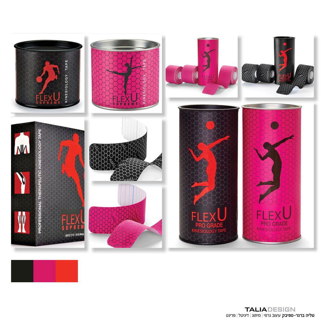
Product Design (The Hexagon Pattern): I designed a unique hexagonal pattern that was printed directly onto the flexible tapes. This wasn’t just an aesthetic choice; the geometric pattern acts as a functional visual guide, allowing users to achieve controlled, precise stretching during application based on how the hexagons distort.
Packaging Architecture & Design: I created a clean, minimalist packaging system for the entire product line (single rolls, three-packs, pre-cut, and continuous). I integrated the signature hexagon pattern into the background of the dark packaging to establish brand continuity.
Color-Coded Visual Identity: To differentiate the tape colors (such as black and pink), I utilized dynamic, color-coordinated silhouettes of athletes in mid-action on the front of the packaging. This instantly communicated the product’s color and its target demographic (active sports and recovery) at a single glance.
(Product photography: Omri Miron)