Phocus Real State
Marcela Cavalini
Published
ABOUT THE BRAND
Phocus is a real estate development company specializing in residential construction. More than building structures, it creates homes that combine functionality, aesthetics, and purpose. Each project is designed with care, technique, and sensitivity, turning spaces into meaningful places. Guided by the vision of going beyond traditional construction, Phocus builds lasting communities and environments that evolve with people. Its approach merges technical expertise with human connection, delivering modern, elegant, and trustworthy results.
CHALLENGE
The challenge was to visually represent a brand that balances diverse values without losing clarity. Phocus needed an identity that showcased its technical precision without appearing generic or rigid, while also expressing modernity, sensitivity, and commitment to the future. The brand required a strong presence in the popular market while maintaining a refined, technological, and artistic aesthetic that feels both contemporary and timeless.
SOLUTIONS
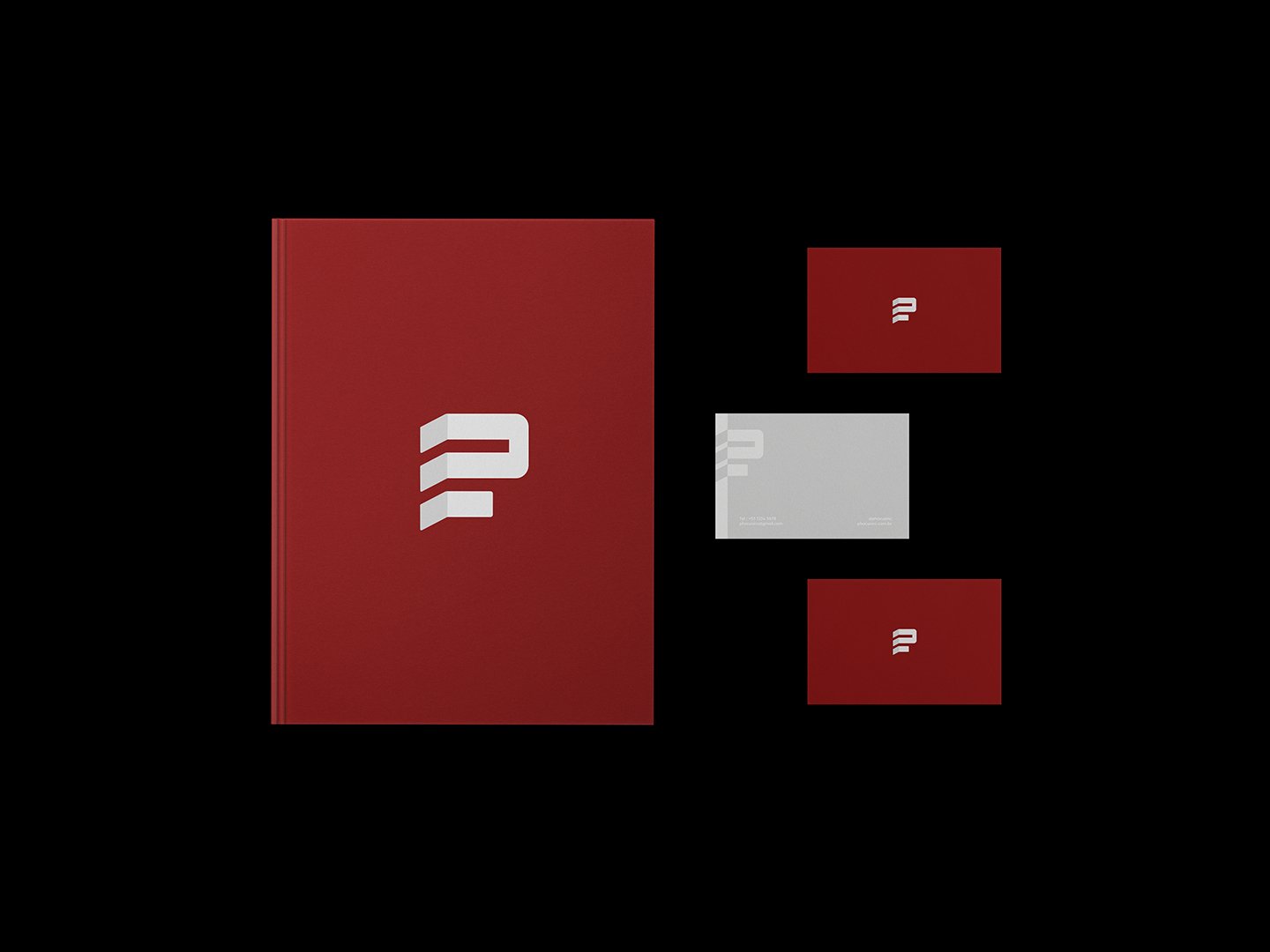
The identity combines structure and symbolism, with a logo inspired by the side vertex of a building that also reveals the letter “P.” The color palette reflects the brand’s essence: deep wine conveys sophistication and strength, black and gray reinforce seriousness and precision, and golden yellow adds vitality and emphasis. The Geologica type family brings a clean, geometric, and architectural language that balances modernity with visual comfort. The result is a structured and refined identity that stands out in both the technical market and among audiences attuned to aesthetics.