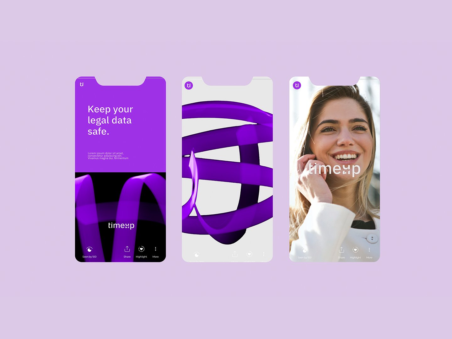
TimeUp
Marcela Cavalini
Published
ABOUT THE BRAND
TIMEUP is a management system designed for law firms, created to transform operations through technology that saves time, increases accuracy, and improves client service. Combining accessibility and innovation, the software streamlines processes and makes legal routines more agile and strategic.
CHALLENGE
The challenge was to represent a technological and modern solution without losing the sobriety required by a legal audience. The brand needed to communicate efficiency and innovation while avoiding clichés and maintaining a sophisticated, discreet aesthetic. The name itself carries dual meaning: optimizing time and symbolizing growth and progress, which had to be expressed visually and conceptually.
SOLUTIONS
The highlighted “UP” element represents growth and the elevation of law firm processes. The logo combines the letters T and U into a modern, functional, and memorable symbol. A palette of vibrant and dark purple with neutral greys balances modernity, energy, and trust with the seriousness expected in the legal sector.