Jogubais Exports Brand Identity and Packaging Design
Aarya Ghule
Published
Full brand identity and packaging design project for Jogubais Exports Private Limited, an organic food company rooted in India’s finest agricultural regions, beginning with jaggery and expanding into a complete range of chemical-free, thoughtfully sourced produce for Indian households, health-conscious urban consumers, and international export markets.
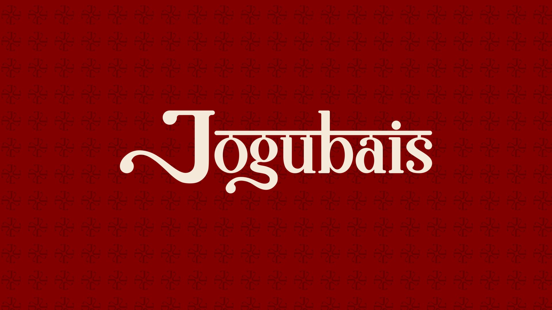
The creative direction draws from the depth of Indian heritage: deep maroons, forest greens, saffron yellows, and earthy creams, in a visual world that is boldly Indian without being nostalgic, and premium without being inaccessible. The logomark is built from four J letterforms in rotational symmetry, creating a mandala-like mark that reads simultaneously as a monogram and a subtle abstract reference to the sacred Vedic swastika, a symbol of auspiciousness and prosperity. The primary wordmark is set in a customised version of Basgira, a characterful serif with a flowing J descender that references Jogubai, the Hindu goddess the brand is named after, while a horizontal mattra line above the letterforms pays quiet tribute to Devanagari typographic heritage.
Packaging design spans jaggery powder, jaggery cubes, and farm-fresh pulses, each designed to be shelf-loud in retail while carrying the warmth and integrity of the brand’s agricultural origins.
Deliverables included brand identity, logo suite, colour palette, typography system, packaging design, stationery suite, brand assets, export collateral, and social media identity.
Services: Brand Identity · Logo Design · Packaging Design · Typography · Colour System · Brand Collateral · Social Media Design