LUMEA: Brand Identity for a Plant-Powered Skincare Brand
Lydia
Published
0
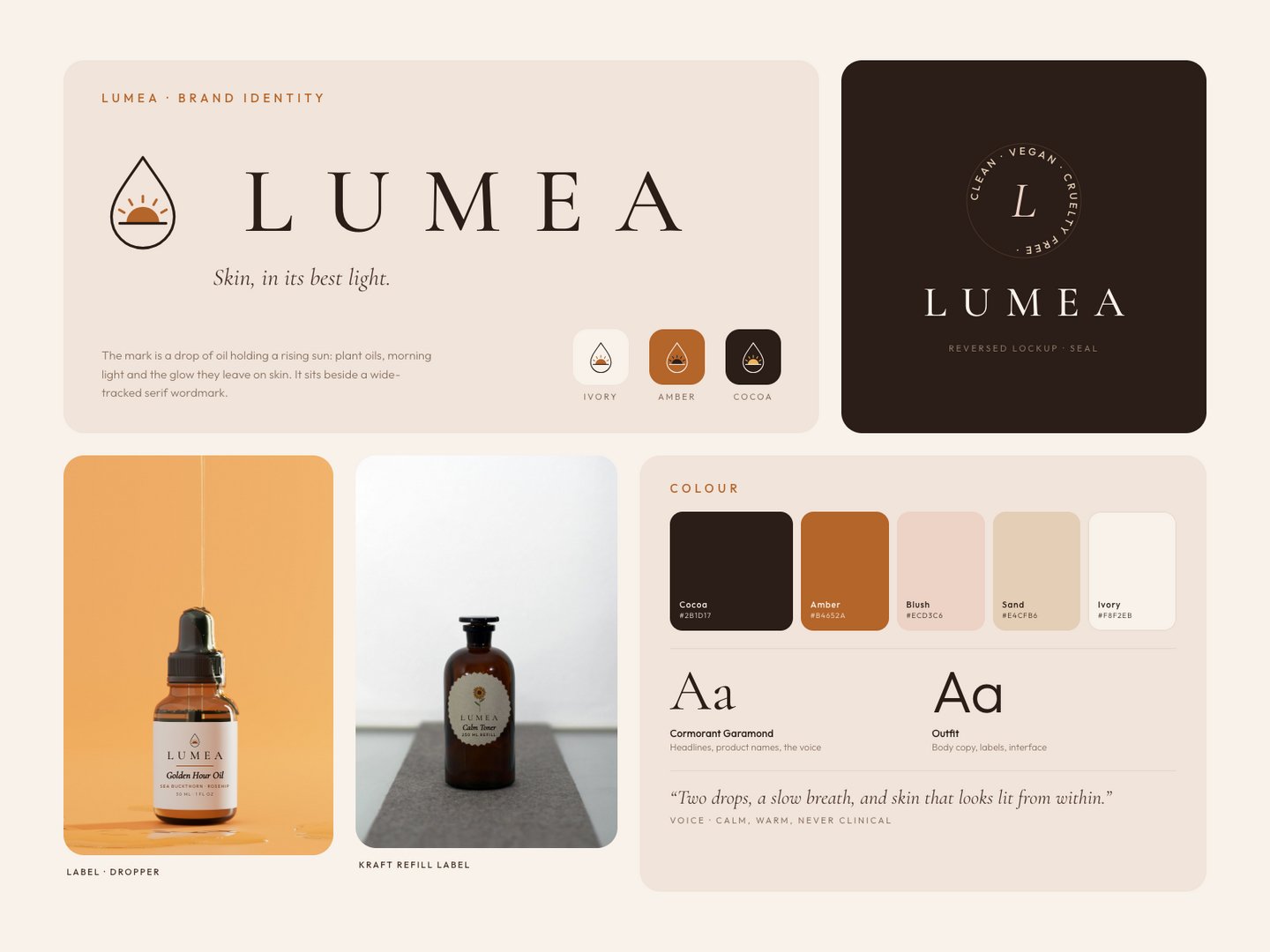
"Skin, in its best light."
The brief: a calm, warm identity for LUMEA, a plant-powered skincare brand in amber glass. It needed to feel premium without being clinical, and to work everywhere from a 30 ml dropper label to a social feed.
What I designed:
- The mark: a drop of oil holding a rising sun (plant oils, morning light and the glow they leave on skin), paired with a wide-tracked serif wordmark
- Logo system: primary lockup, reversed version, a “Clean · Vegan · Cruelty free” seal, and mark-only versions on ivory, amber and cocoa
- Colour and type: cocoa, amber, blush, sand and ivory, with Cormorant Garamond for the voice and Outfit for everything functional
- Packaging: the label printed onto real product photography, on a dropper bottle and a kraft refill label
LUMEA is a fictional brand. Concept by Invicta Studio, with photography via Unsplash.