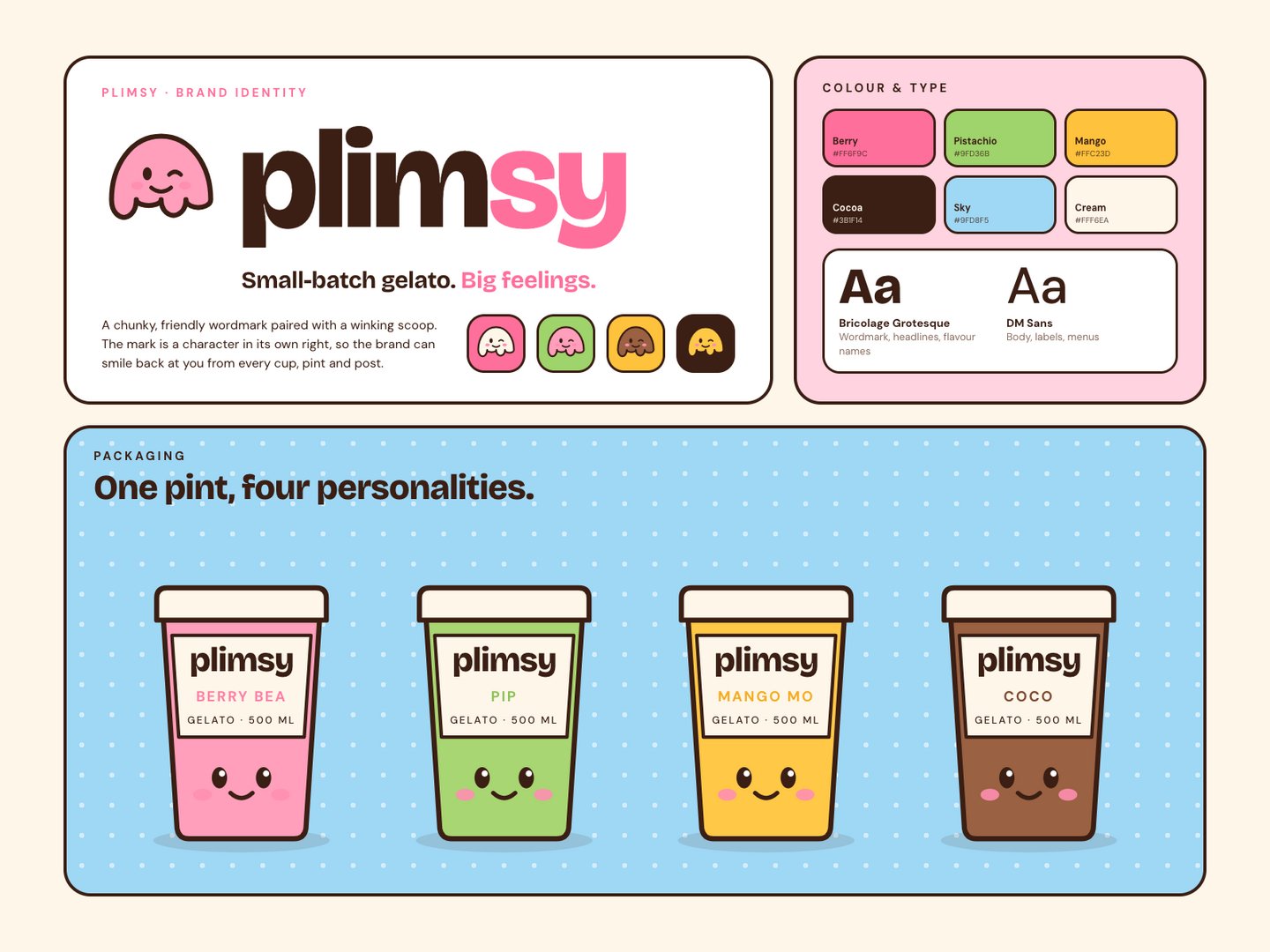
PLIMSY: Playful Brand Identity for a Gelato Shop
Lydia
Published
0
"Small-batch gelato. Big feelings."
The brief: a bright, joyful identity for PLIMSY, a small-batch gelato shop. It had to feel fun enough for kids and design-led enough for adults, and give the brand a personality people want to follow.
What I designed:
- Wordmark and mark: a chunky, friendly Bricolage Grotesque wordmark and a winking scoop. The mark is a character in its own right, so the brand can smile back from every cup, pint and post.
- Colour system: Berry, Pistachio, Mango, Cocoa, Sky and Cream, with each flavour owning a colour
- Type: Bricolage Grotesque for headlines, DM Sans for everything else
- Packaging: a pint range where every flavour gets its own colour and a face on the tub: Berry Bea, Pip, Mango Mo and Coco
PLIMSY is a fictional brand. Concept by Invicta Studio.