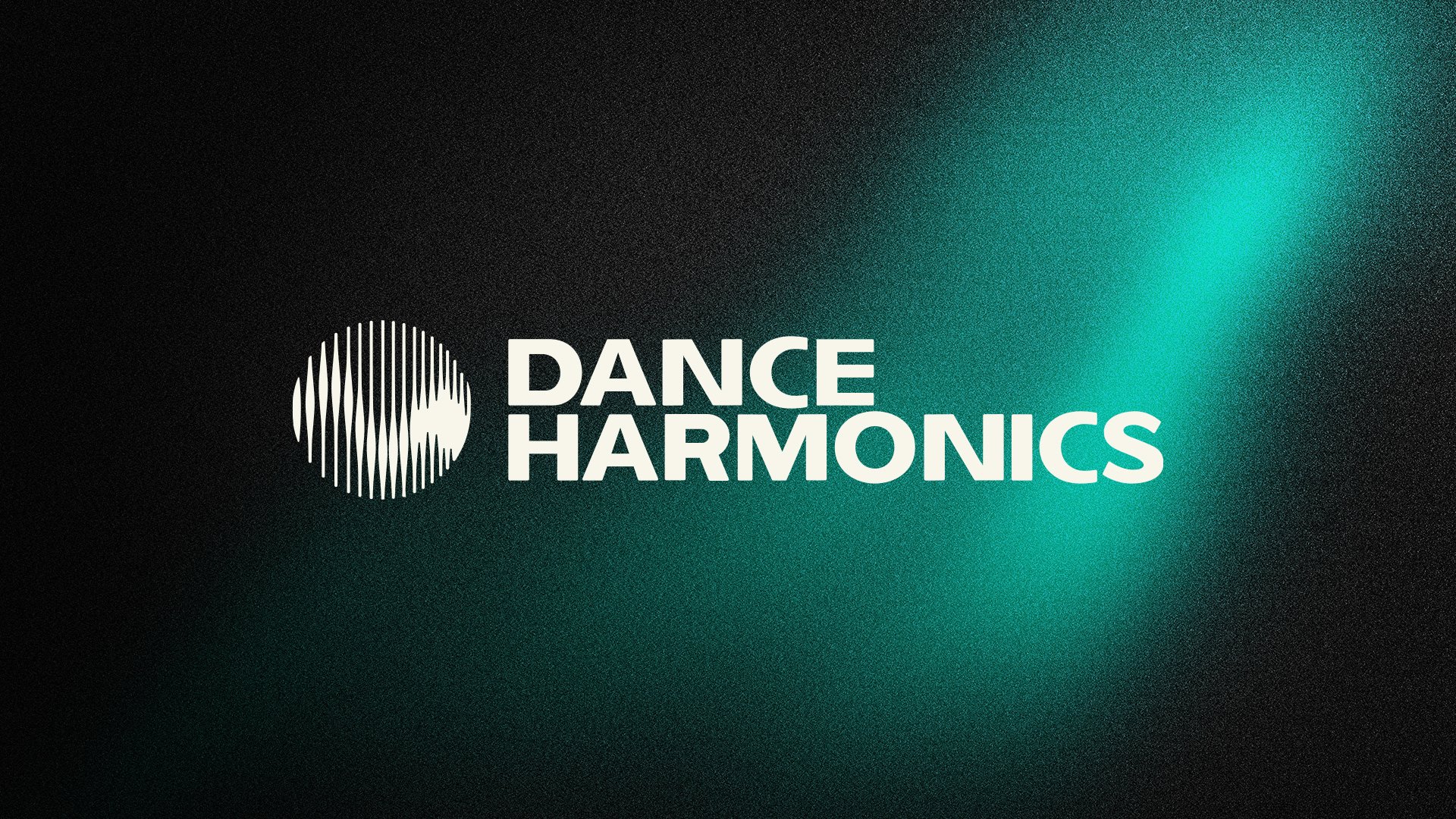
Dance Harmonics Label - Visual Identity
Astrid Catalina Alexandru
Published
Dance Harmonics is a visual identity created for a dance music label. The logo draws from the concept of harmonic saturation, where overtones build upon a fundamental frequency to create depth and texture. This idea became the foundation of the identity. The circular logo uses vertical lines to evoke layered frequencies and resonance, while a bold typographic system and vibrant electric colours capture the energy and movement of the music itself. Darker supporting tones provide balance, allowing the brighter elements to feel even more luminous.
The result is a visual identity that reflects the label’s ambition to create fuller, richer, and more immersive musical experiences.
· Concept Development · Logo Design · Visual Identity · Typography · Colour Palette · Merchandise Design
#graphicdesigner #visualidentity #logodesigner #branddesigner