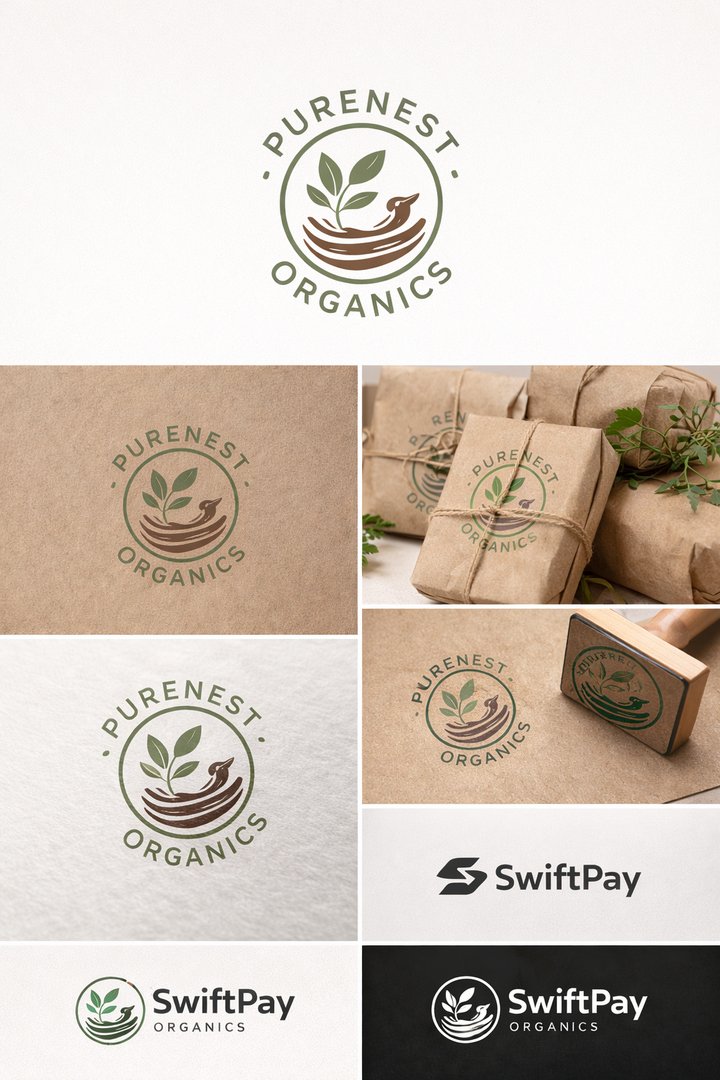
PureNest Organics – Eco Brand Logo Design
Alfred Brain
Published
Project Overview:
PureNest Organics specializes in sustainable teas and wellness products. The brand required a logo that conveyed eco-conscious values and authenticity.
Design Approach:
I created a circular emblem featuring a leaf integrated into a nest symbol to represent care, sustainability, and nature. The typography was handcrafted to give the brand a warm, organic feel.
Color Strategy:
Earth tones including forest green and soft brown were chosen to align with eco-brand positioning.
Deliverables:
Emblem logo
Simplified icon for packaging
Stamp-style version
Black & white variation
Print-ready vector files
Result:
The brand achieved a cohesive identity suitable for product packaging and farmers market distribution. #photo #graphicdesigner #logo #illustrator #branding #designer #webdesigner